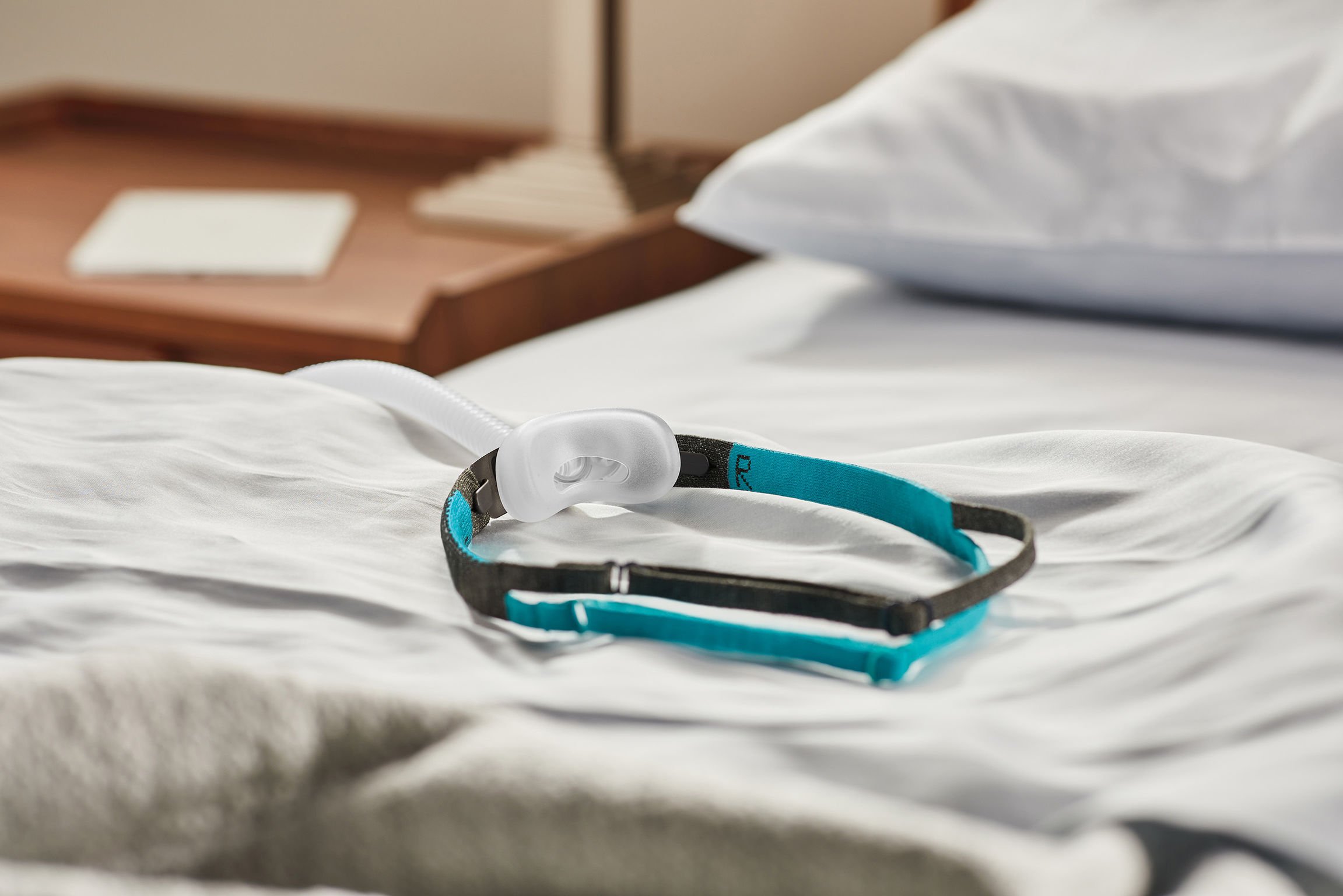
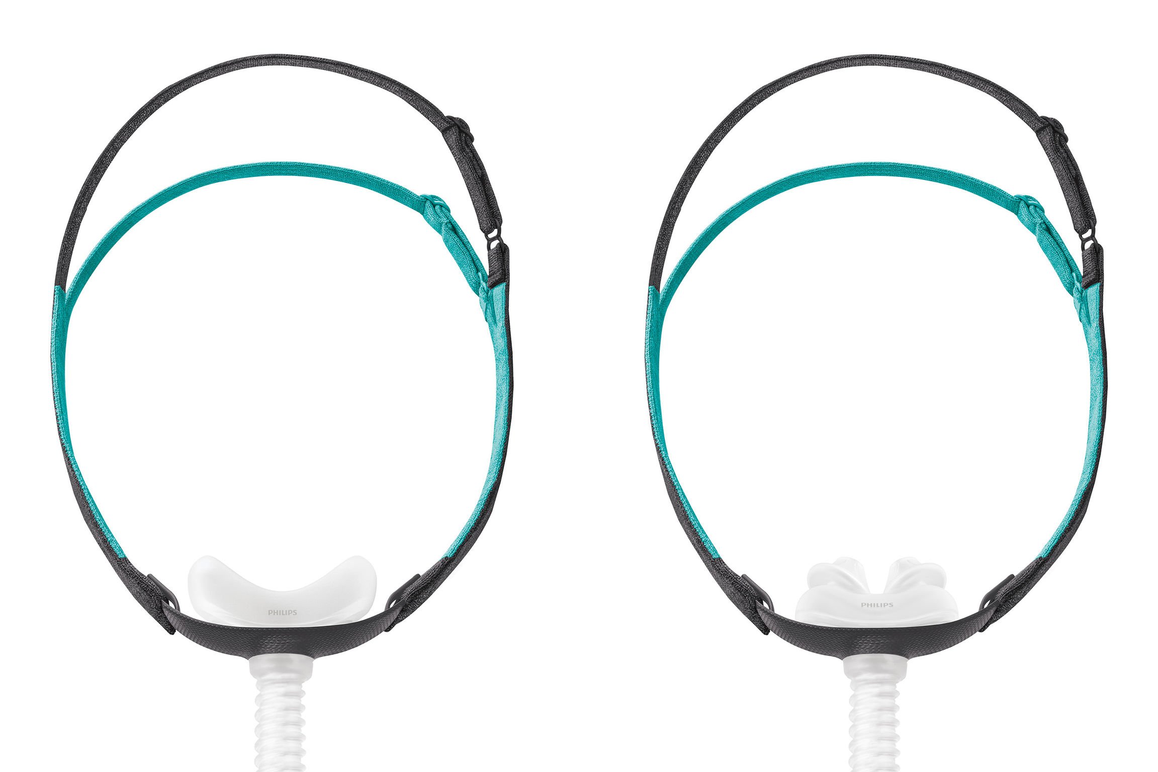
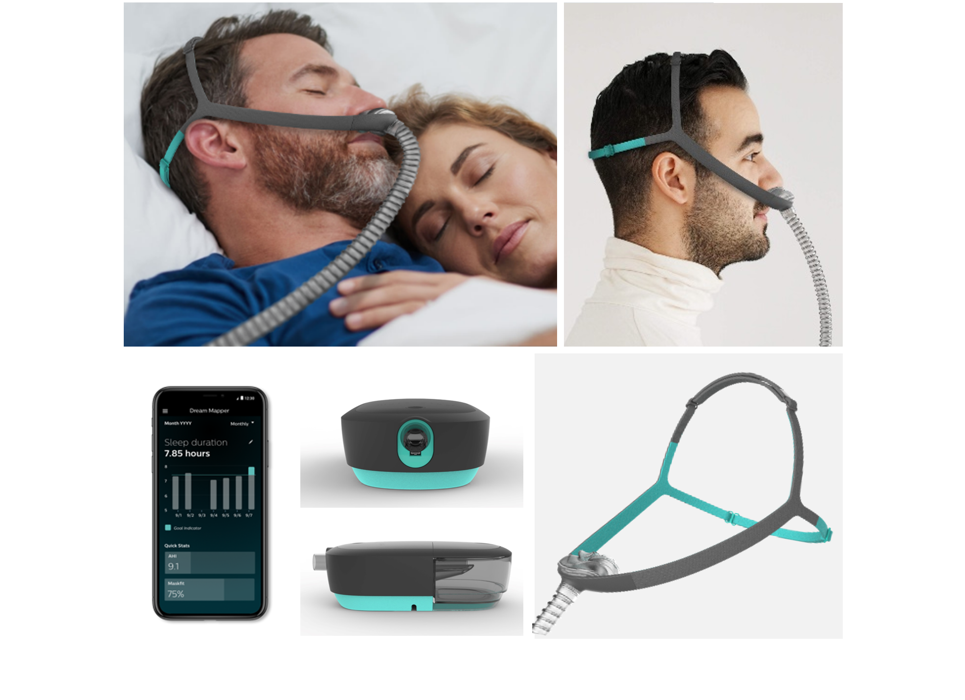
Therapy Mask 3100 NC & SP

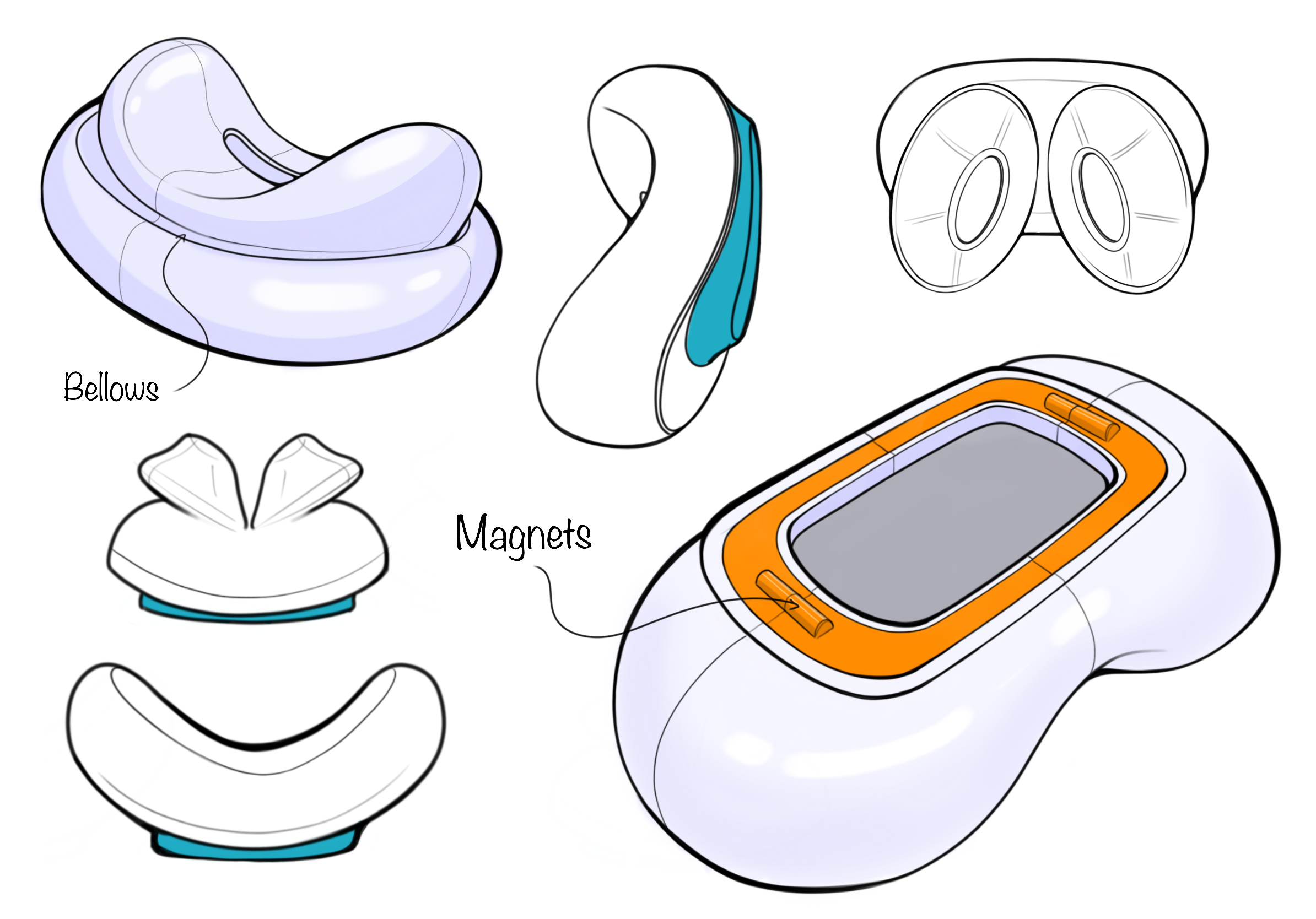
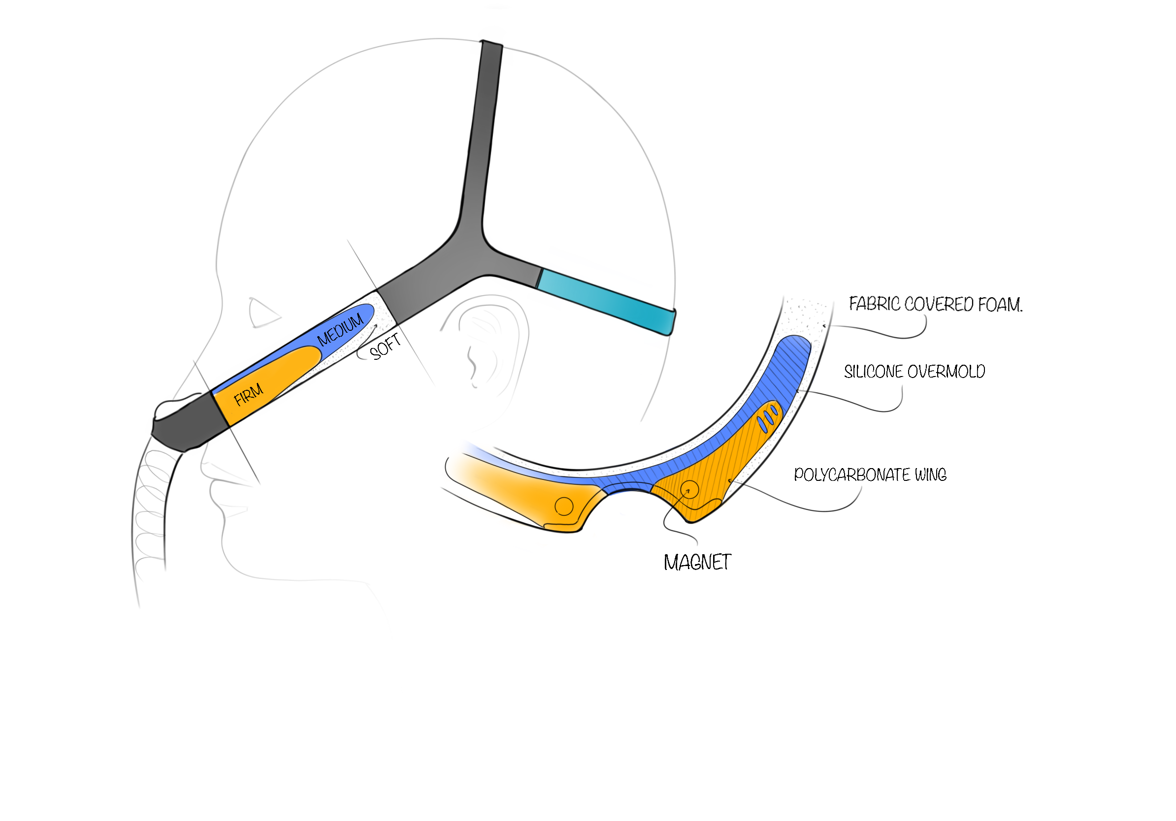
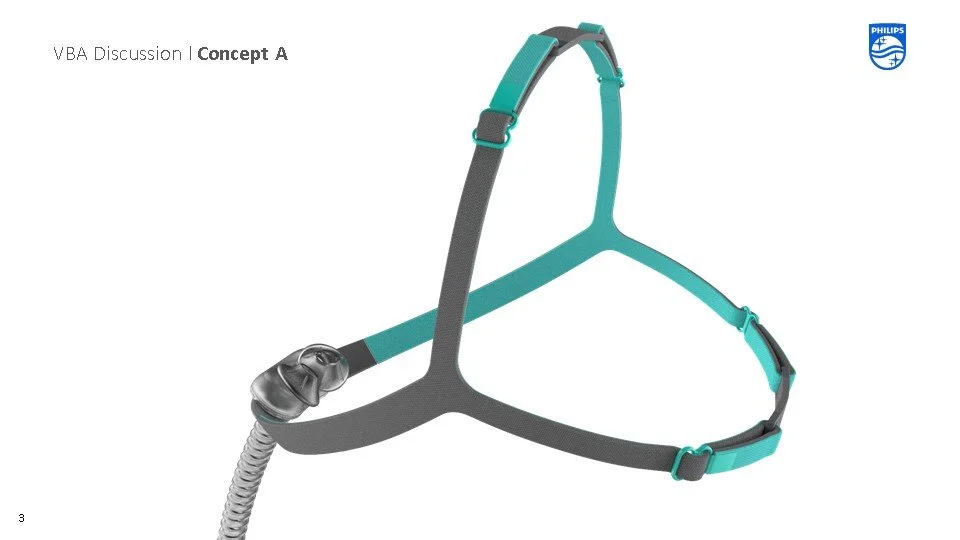
This ultra-minimal, low-cost, nasal mask uses a unique modular magnetic cushion attachment and digitally flatbed-knit headgear. Designed to promote wellness rather than to treat illness, it challenges the stigmas around CPAP masks today. Clinically efficacious yet sleep-appropriate, the redesigned mask elevates the look and feel, and raises the quality of the patient experience. It is built around a simple frame chassis with a modular, magnetic attachment that enables easy switching between two cushion types for optimal comfort. Employing color elements for directionality and natural understanding increases ease of use.


Who is this for?
What is Sleep Apnea?
Sleep apnea is a potentially serious sleep disorder in which breathing repeatedly stops and starts. The main types of sleep apnea are:
• Obstructive sleep apnea (OSA) the more common form that occurs when throat muscles relax.
• Central sleep apnea occurs when the brain doesn't send proper signals to the muscles that control breathing.
• Complex sleep apnea syndrome, also known as treatment emergent central sleep apnea, occurs when someone has both obstructive sleep apnea and central sleep apnea.
What is CPAP?
CPAP stands for Continuous Positive Airway Pressure. People with moderate to severe sleep apnea might benefit from using a CPAP machine that delivers pressurized air through a mask throughout the night. With CPAP, the air pressure is high enough to force your upper airway passages open, thus preventing apnea events and snoring.
It is estimated that sleep apnea impacts over 1 Billion around the world
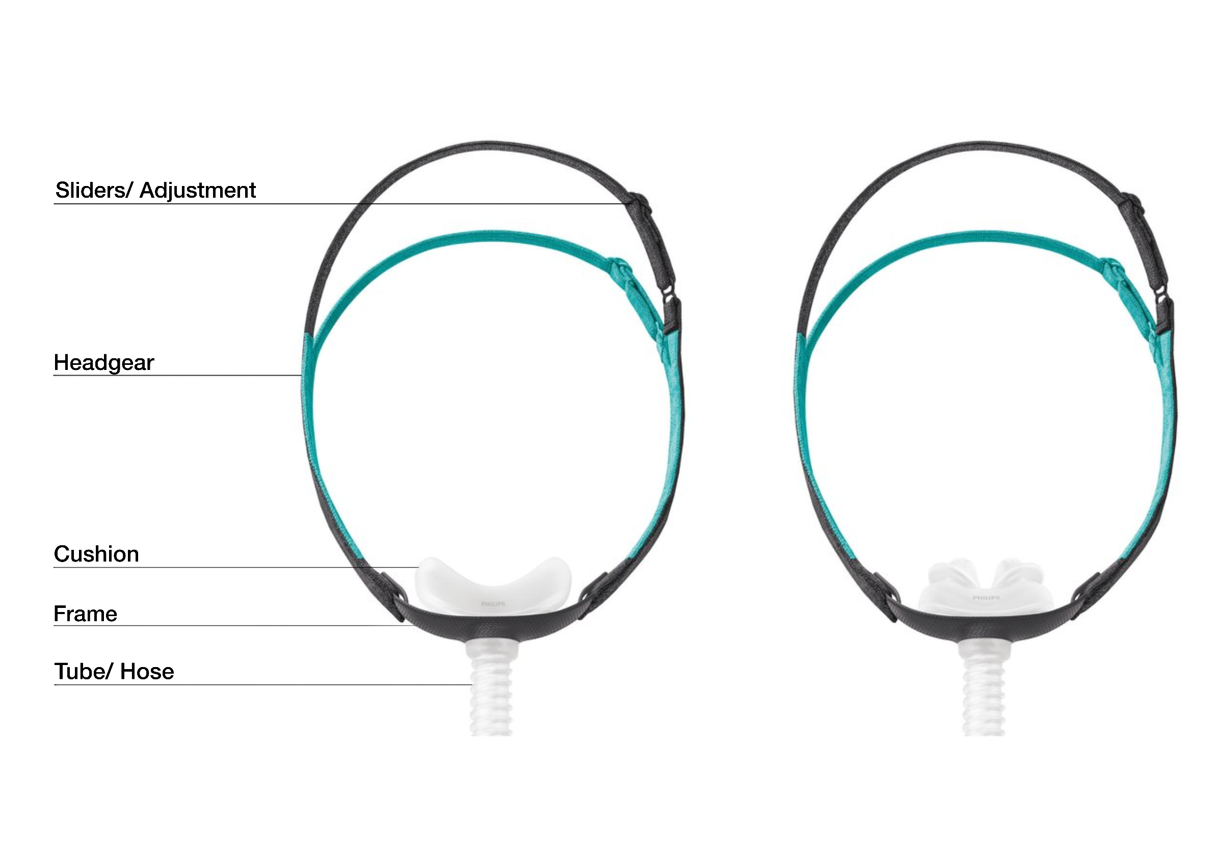
What is it comprised of?
Why design this?
Why did Philips choose to enter this space?
At the time Resmed was dominating the low cost nasal mask market with their P10 architecture.
Philips sought to compete in this space and take market share from Resmed.
Voice of Customer (Resmed P10)
Likes
Less invasive
Lower cost
Multiple cushion options
Dislikes
Knit Headgear stretches out over time
No adjustments
Easy to put on backwards/ Upside down

Resmed P10 (Competitor Mask)
Project Scope
“Develop a lower cost mask that gives patients the flexibility to determine which cushion type works best for them on one platform that is as small as possible all while providing the performance and ease of use clinicians have come to expect.”
Low Cost - $8 Cost Target
Low Profile - Ultraminimal Design
Multiple Cushion Options - Cradle + Pillow
Unique Cushion Attachment - Modular
Objectives
Improve Headgear Adjustments
Seamless Knit Headgear
Simple Cushion Attachment
Improve Environmental Sustainability
Opportunities

Technical Prototype
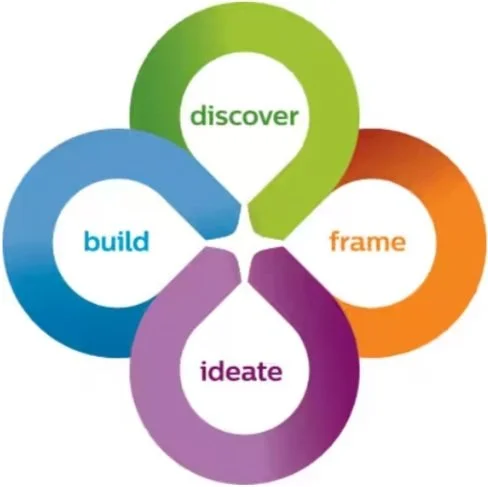
Process | Human-centric Design
Discover
Immerse in people’s daily lives and explore the wider context of their challenges.
Frame
Based on the current situation, define the challenges and opportunities at hand.
Ideate
Transform insights into ideas, explore creatively, then analyze and converge on potential solutions.
Build
Make ideas tangible, build prototypes, test them with users and draw insights to move forward.
Philips Co-create

FRAME
Wellness not illness
Design Ambition
To drive engagement through desire rather than failures of efficiency and usability
To seek positive ways to engage and maintain engagement. Changing the stigma

Framing
Approach:
To kick off the project I planned and facilitated several workshops to map out the user journey and define our design drivers. The goal was to uncover opportunities and define our approach before we began the ideation process.

These drivers were then sorted by physical versus visual and clustered into a few overarching design drivers:
Provoke
Intuitive
Iconic
Minimal
Comfort
Care
Ease of Use
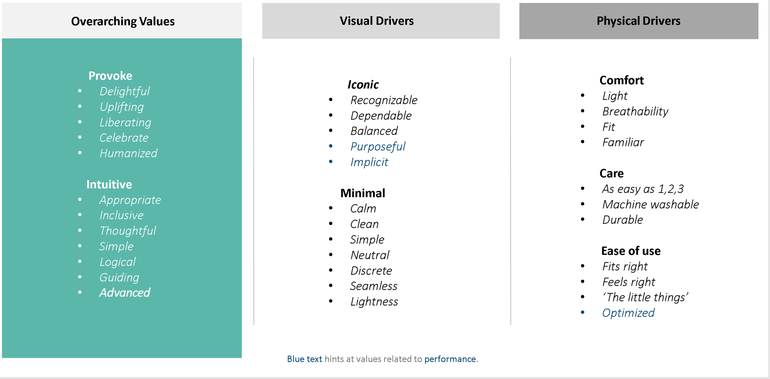

Provoke

Intuitive

Comfort

Minimal

Iconic

Ease of Use

IDEATE
Brainstorm
Approach:
Taking inspiration from the mood boards and design drivers, I then got hands on exploring concepts and ideas that could address the needs of our customers. As a multidisciplinary team we then combined these concepts and pulled out key areas for refinement.
Thought Sketches
Here is just a small sample of the various thought sketches that I explored during the brainstorm phase.


Key Areas of Opportunity
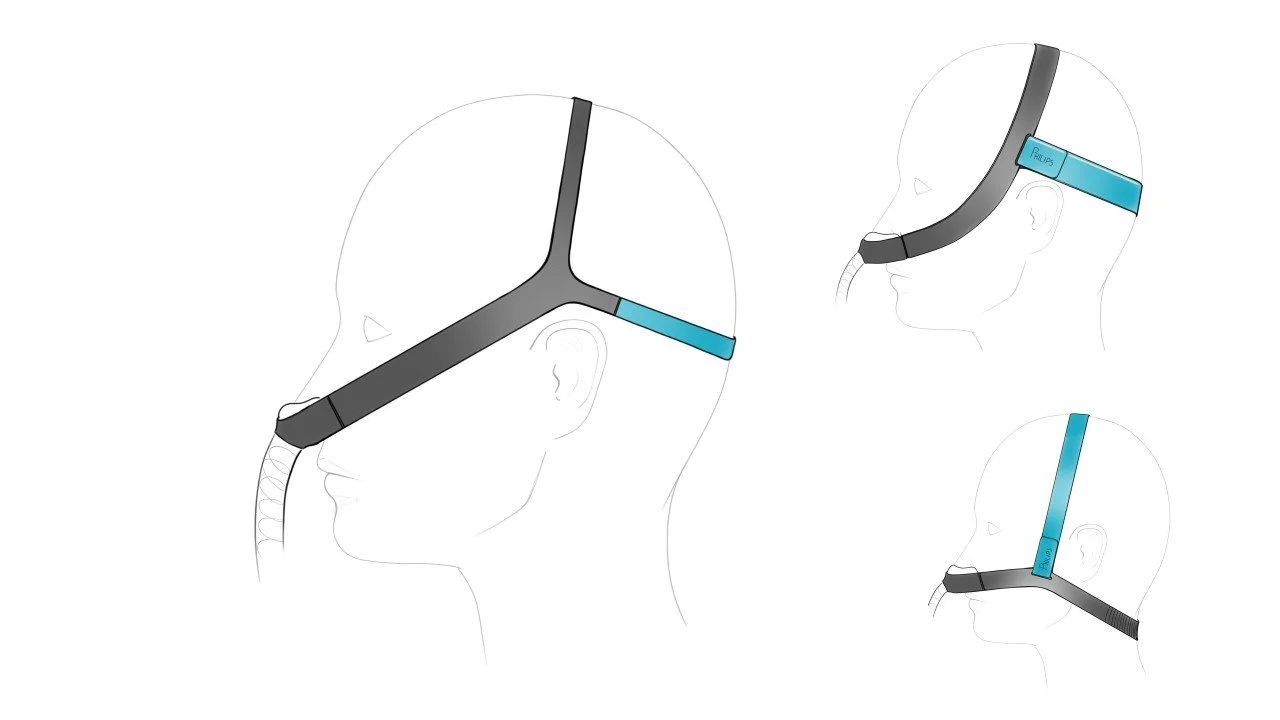
Headgear Architype
•Building on known principles
•Potentially a duo-band
•Distinct silhouette - Iconic
•Guiding – top – blackstrap
Adjustability
•Low Profile
•Natural - vs - manual adjustment
•Soft against head
•Constructed for stretch and hold
Stability
•Frame integrated into knit/fabric substructure
•Co-molding, plastic and textile?
•Material properties transitions (adding increased hold, support and comfort in specific areas.)
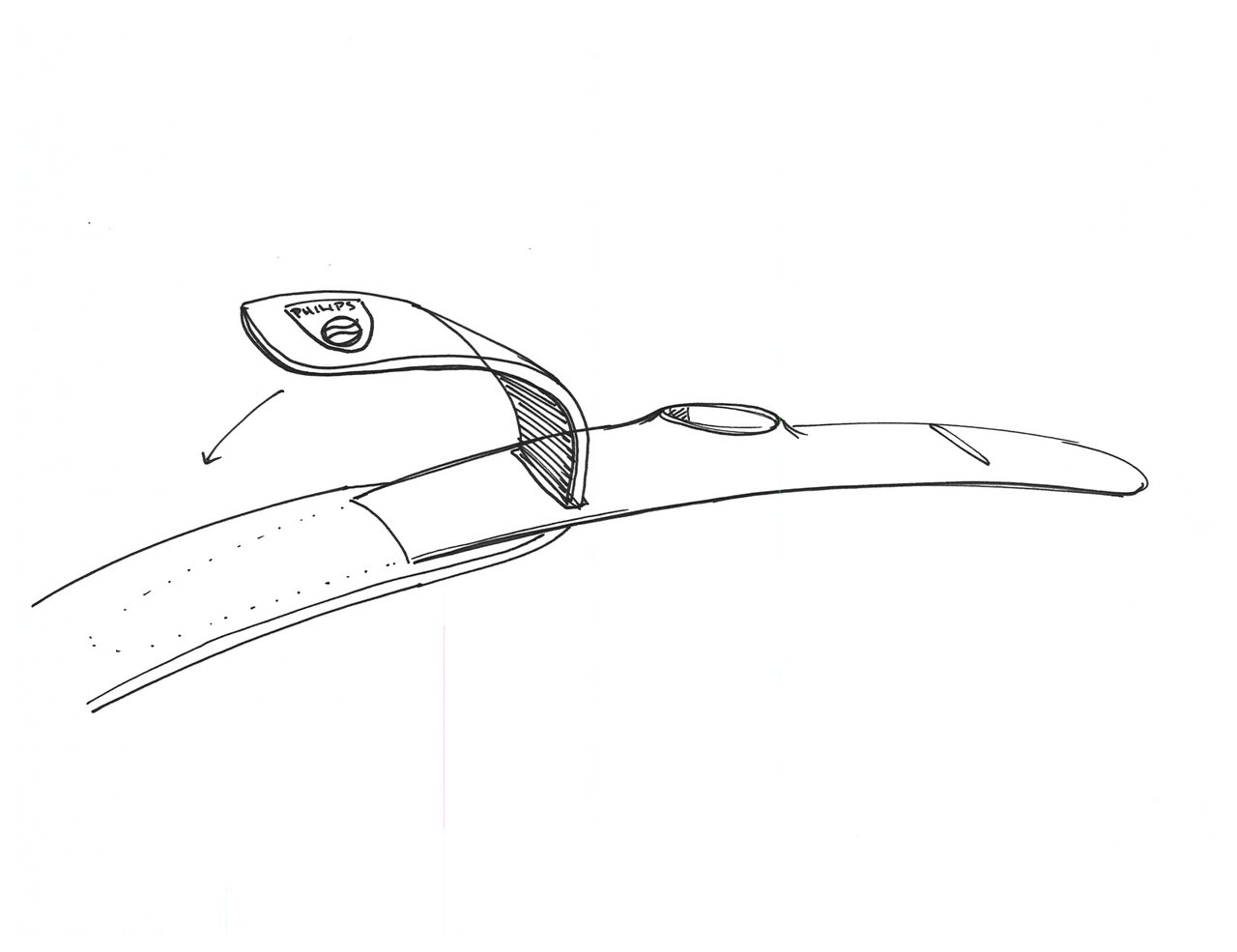
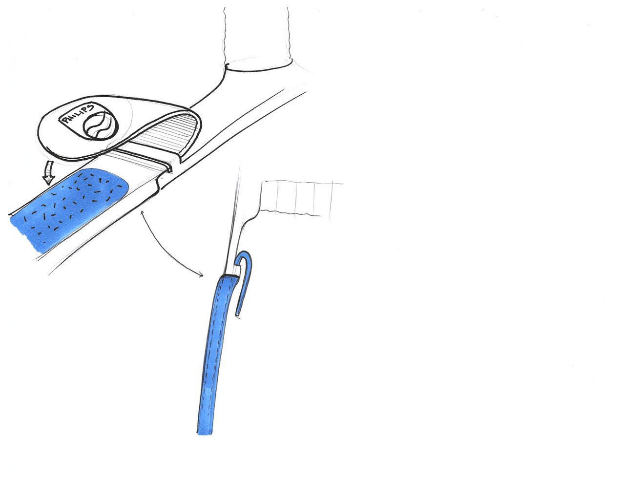
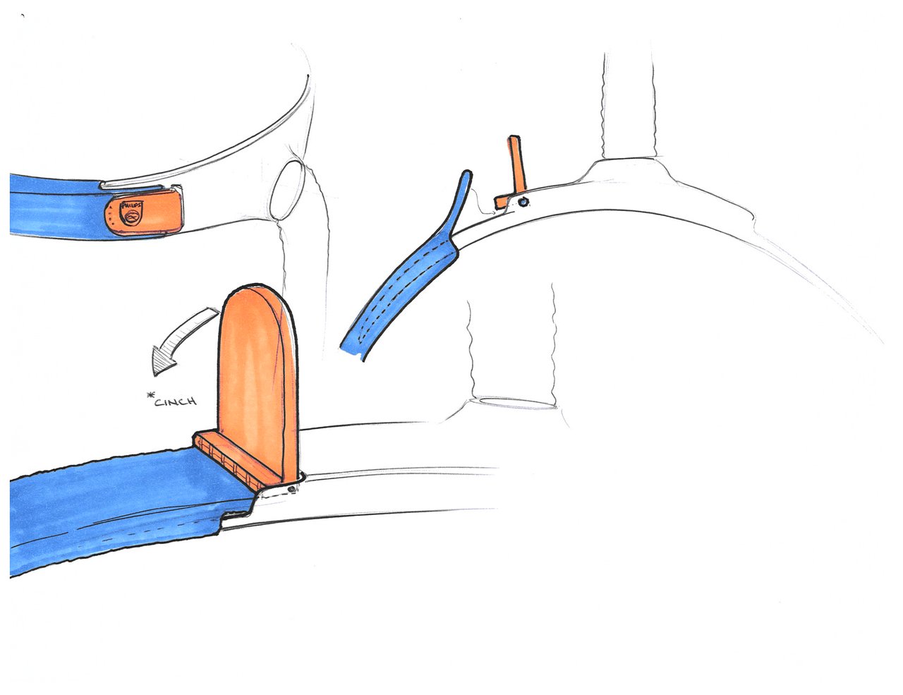
Frame Interface
•Seamlessly integrating hard and soft materials
•Clearly define a zone for attachment
•Quick assembly/dis-assembly
•Magnet integration into the frame
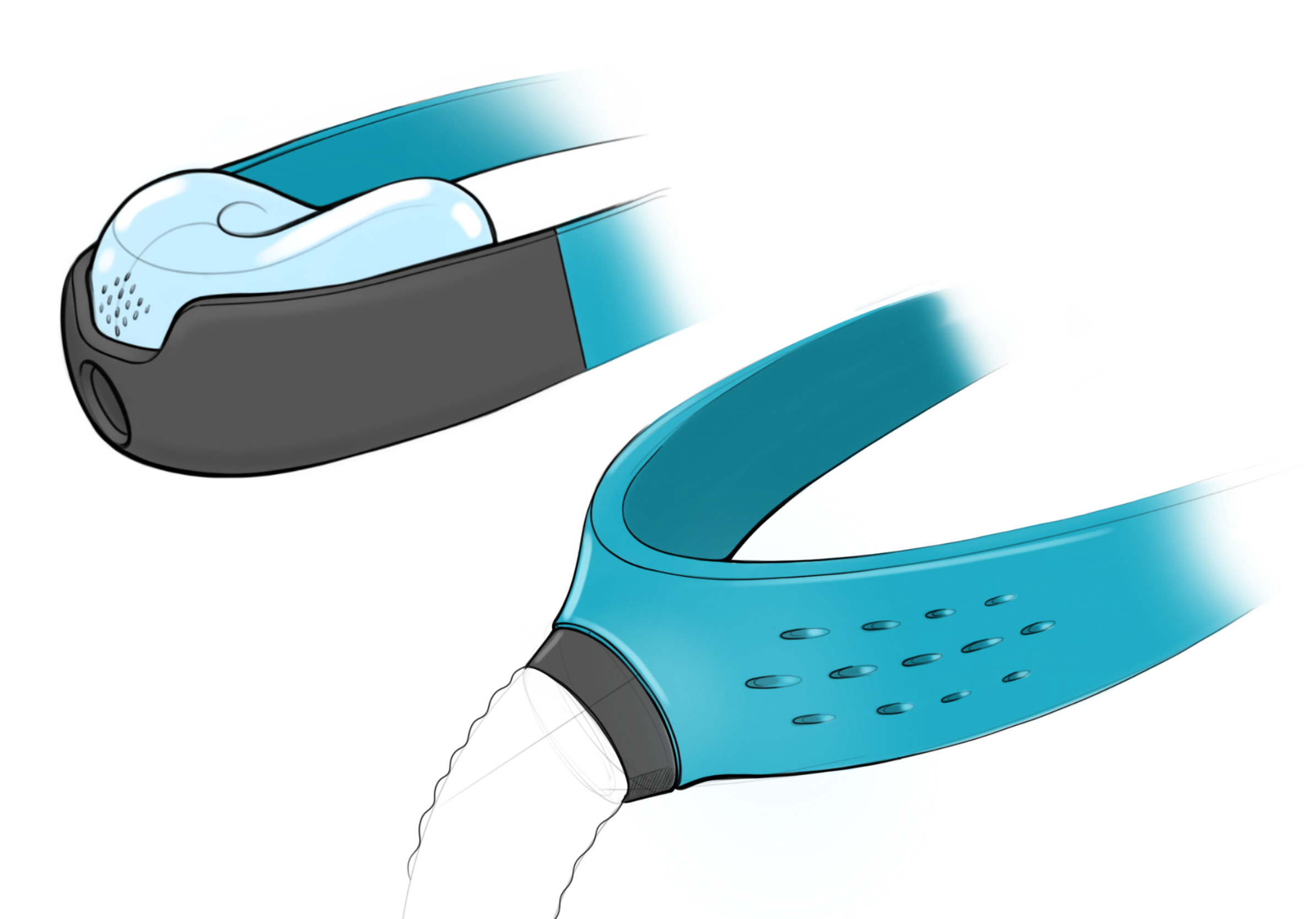
Exhalation
•Integration between cushion and band
•Mesh that reveals the exhalation
•Optimized for silence
•Diffuse and direct the air flow away from the user
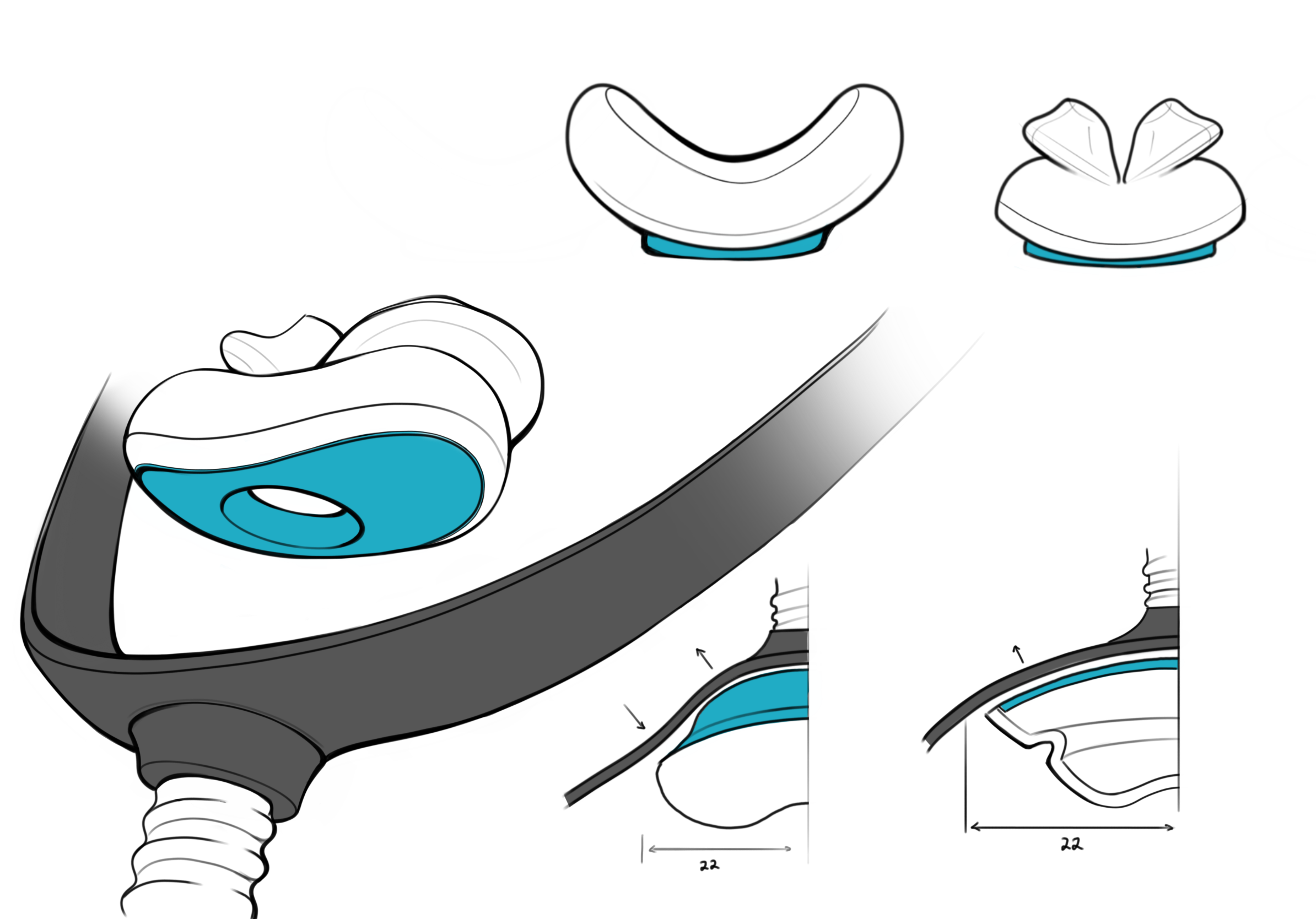
Cushion
•Integration and ease of cleaning
•Using a bellows as a signature comfort feature
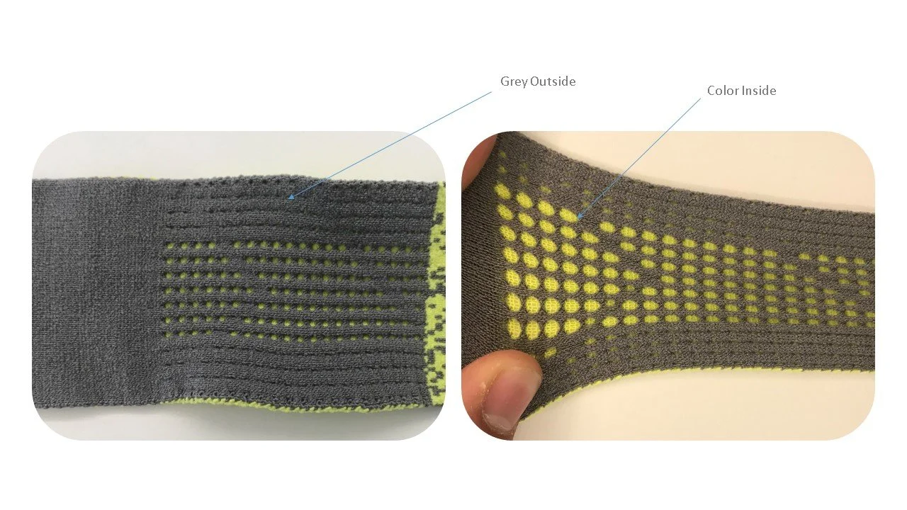
•Color, guiding the user - outer side : inner side
•Use of metal pins rather than physical magnets?

Build
Prototype
Approach:
After defining some key areas for refinement, I love to get hands on and begin building mock ups. From 3D prints to rough hand built models, I began exploring all different aspects of the design.

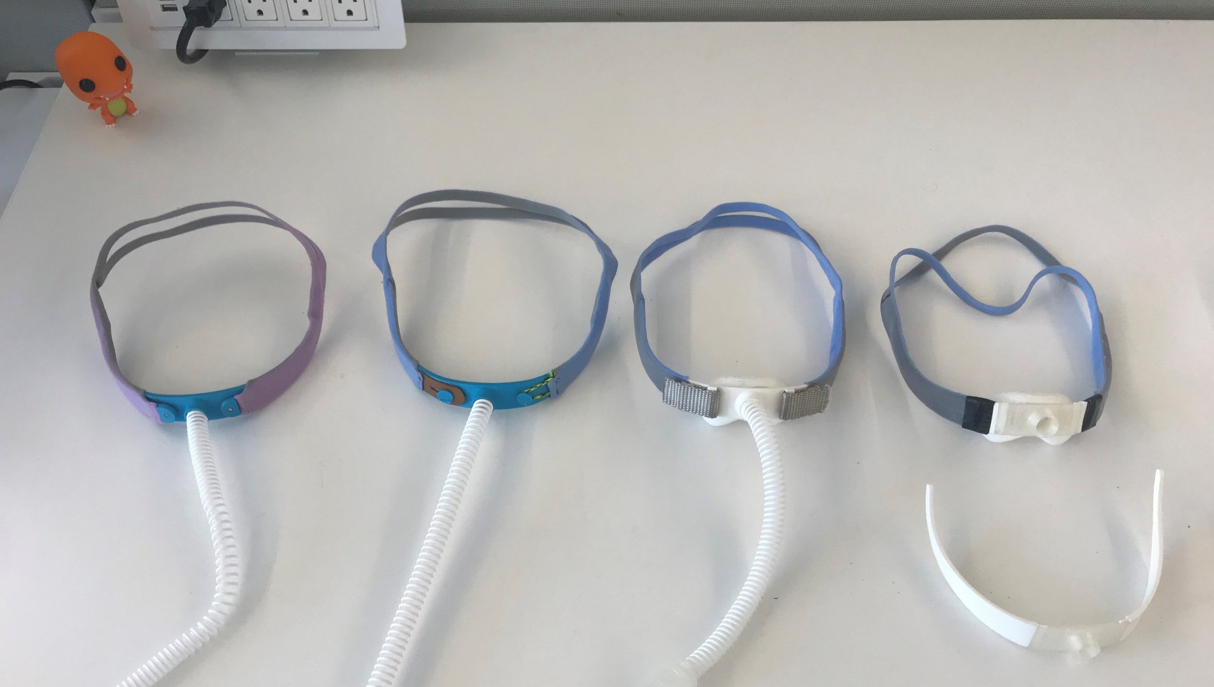
Headgear Mock Ups
Looking at inspiration from athletic gear, fashion, and other wearables/ clothing to inspire ideas and create mock ups.
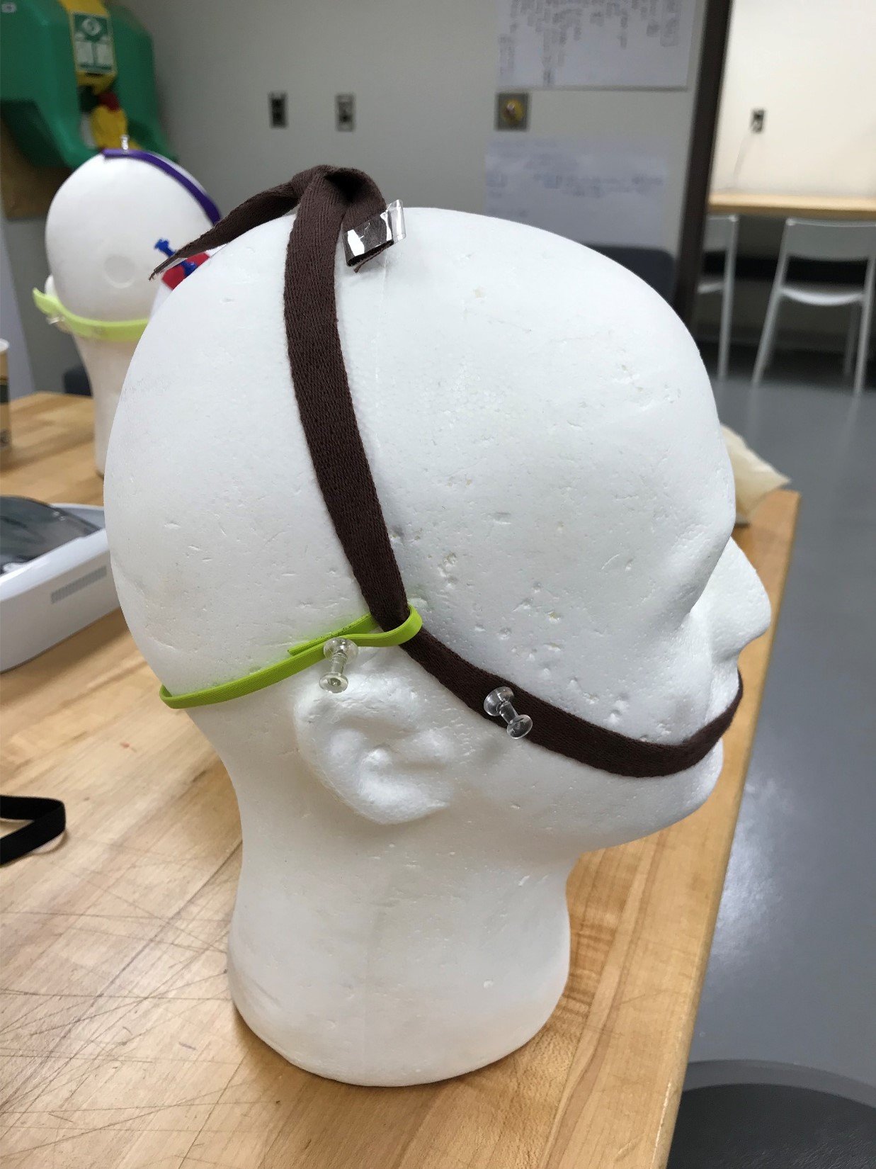
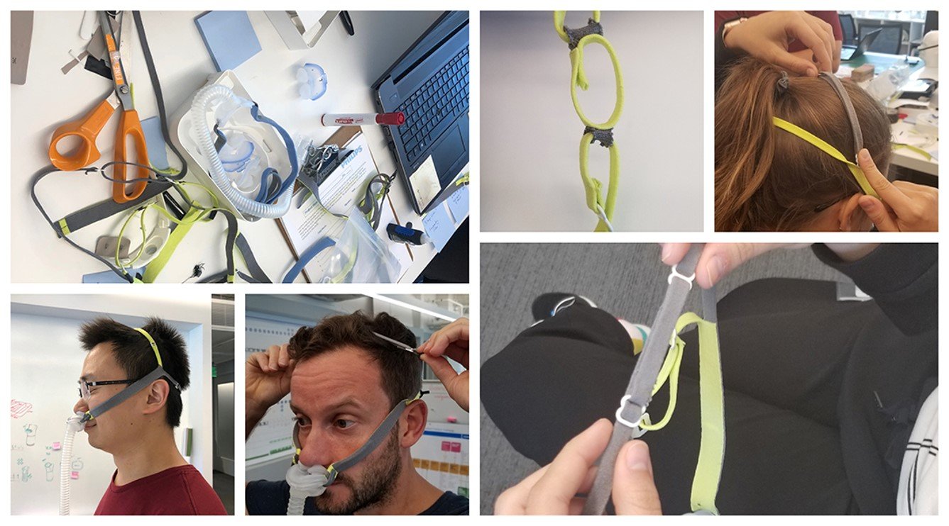
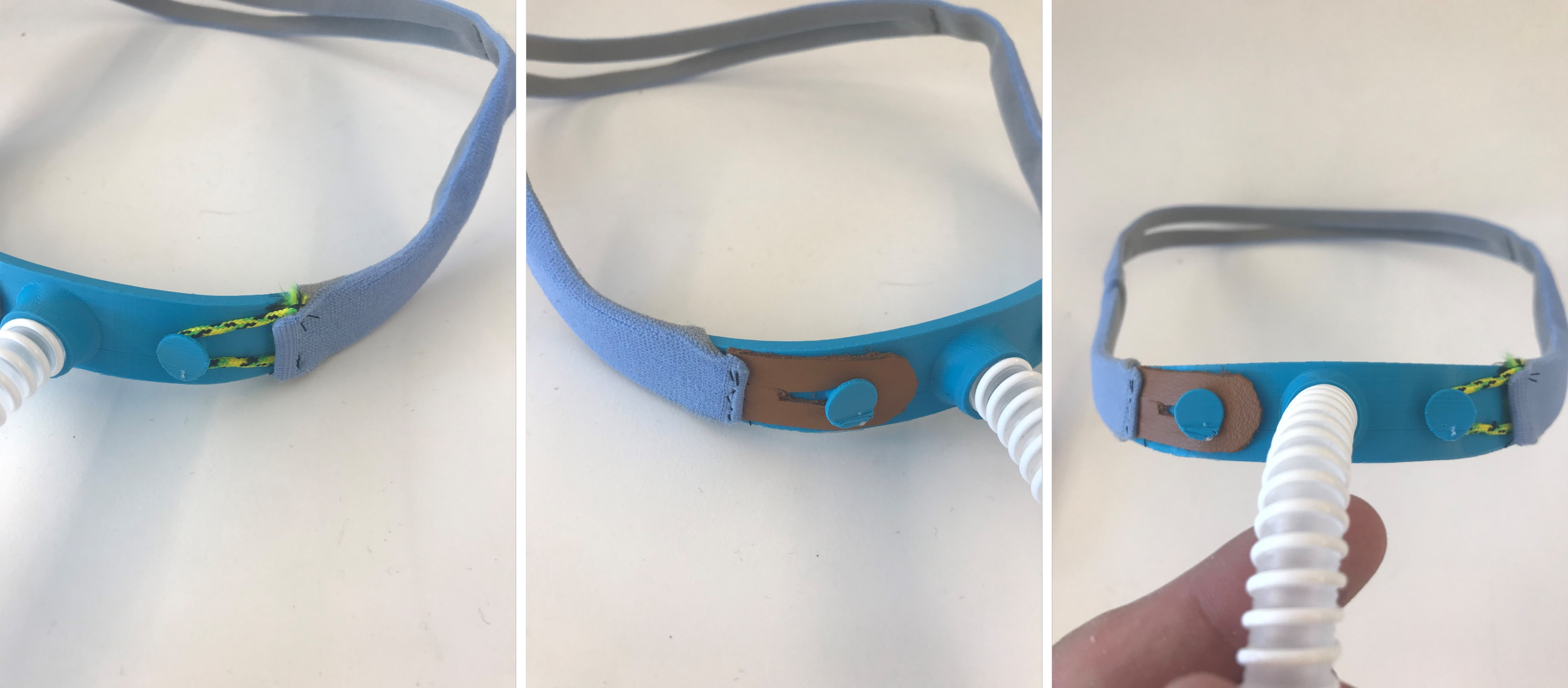
Frame Mock Ups
To explore the frame I did a lot of 3D printing, combining the headgear prototypes with the stability of a plastic frame.
This was a great avenue for us to begin to explore the user interaction and functionality of the mask.


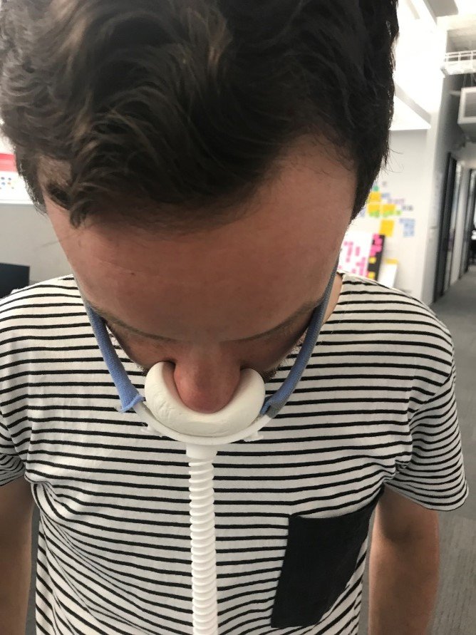
Cushion Mock Ups
The cushion is the part of the mask most intimate to the consumer. This became the hero of the mask, as the therapy delivering component. The process of refining this took a lot of CAD development and 3D printing.


Co-create
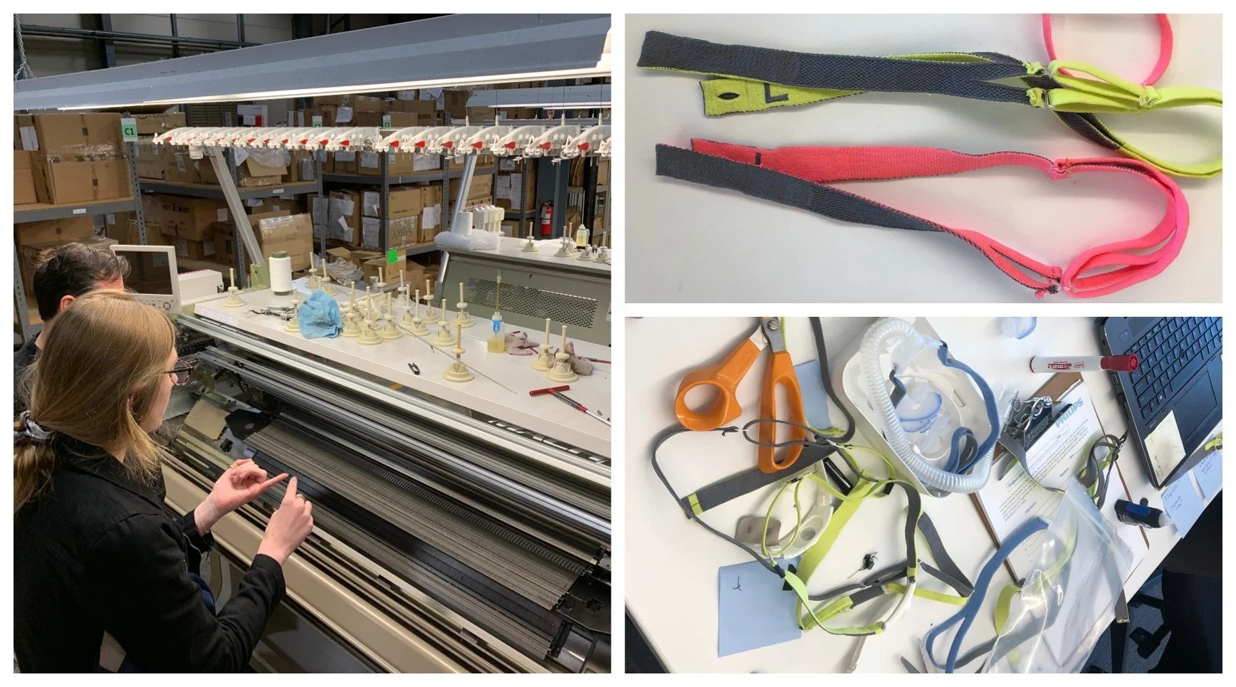
Supplier Collaboration - Shima Seiki
During this project, Philips was looking to invest in a new technology, Digital Knitting.
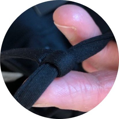
To make sure we were leveraging the maximum abilities of this new technology, we collaborated in a 3 day workshop with the digital knitting machine supplier, Shima Seiki, to push boundaries and develop knit headgear prototypes for the project.
The process lead to a deep understanding of both flatbed and circular knitting techniques and how these technologies could impact the look and feel of our headgear design.

The workshop consisted of whiteboarding ideas, making rough mock ups, then working with the expert digital knit programmers to turn around quick prototypes to evaluate as a project team.

During this rapid exploration we were able to not only push our own boundaries as designers, but also the capabilities of the digital knit machines. For example, during our brainstorm we developed a way to seamlessly knit a 90 degree angle which was something even Shima Seiki thought impossible up to that point in time! (Pictured right)
Knit Refinement
Knit Headgear
As we expanded our knowledge of digital knit, it was time to begin refining the headgear. This was an opportunity for us to create a clear differentiator. The key considerations we were keeping in mind were:
Comfort
Quality
Appropriate for the bedroom
Stylish / Appealing

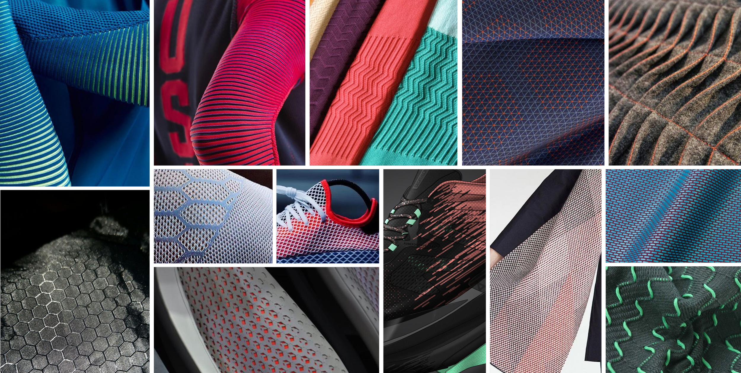
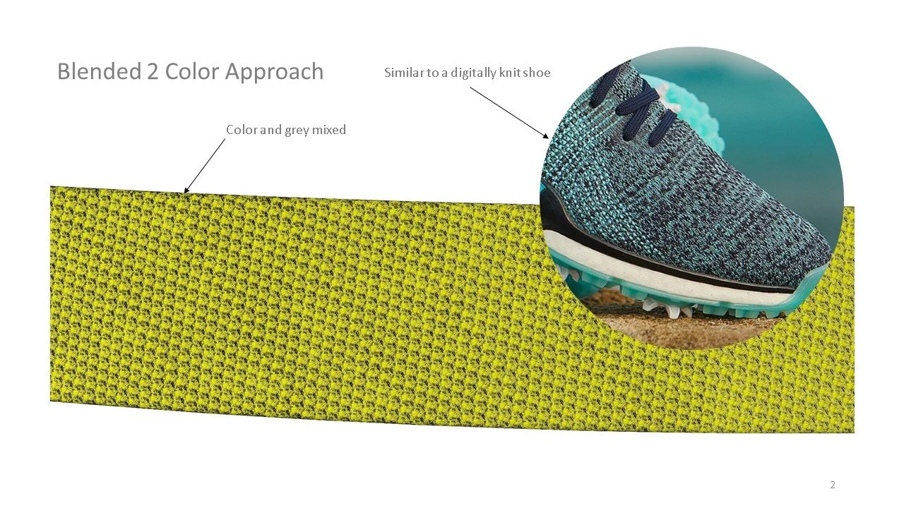
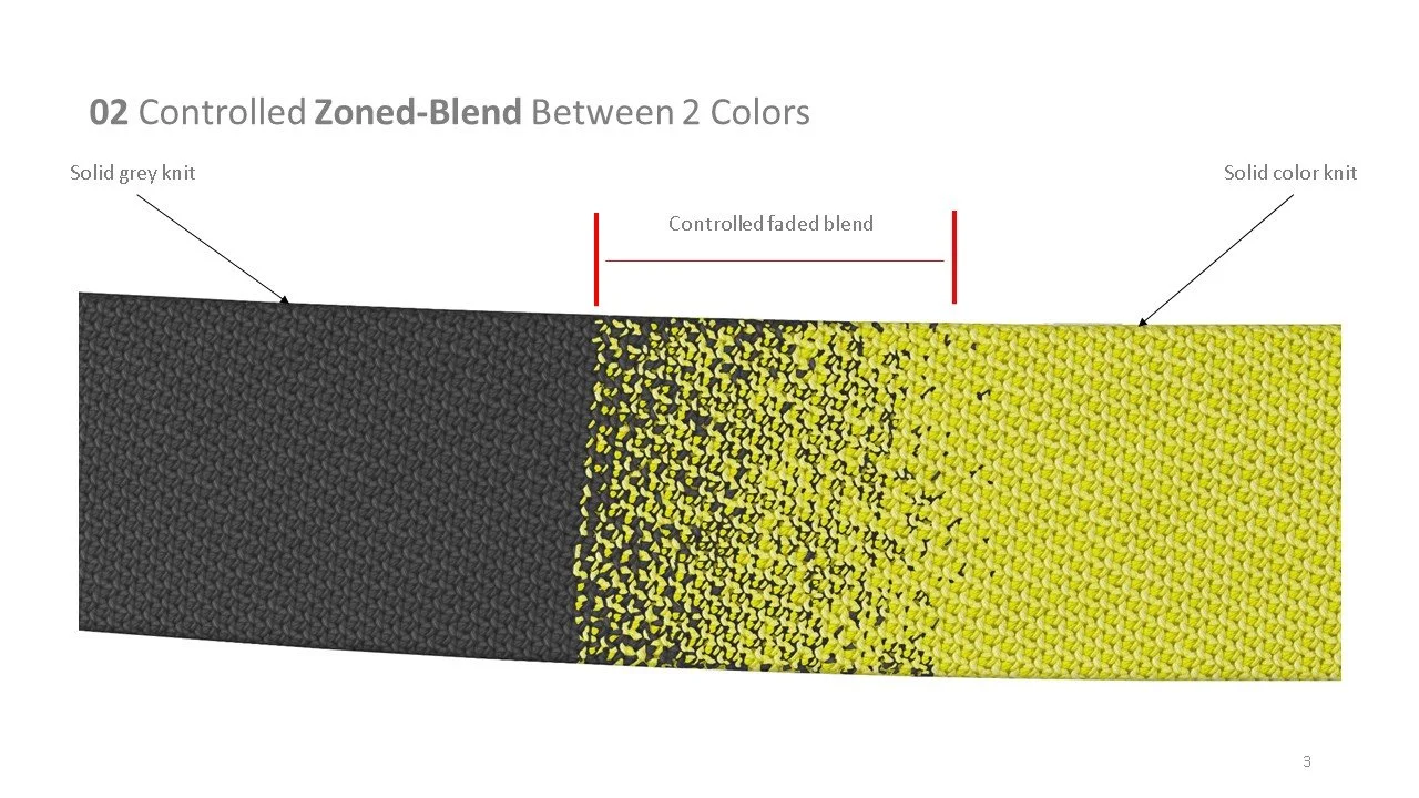
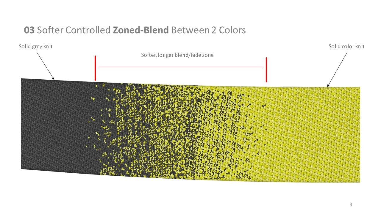
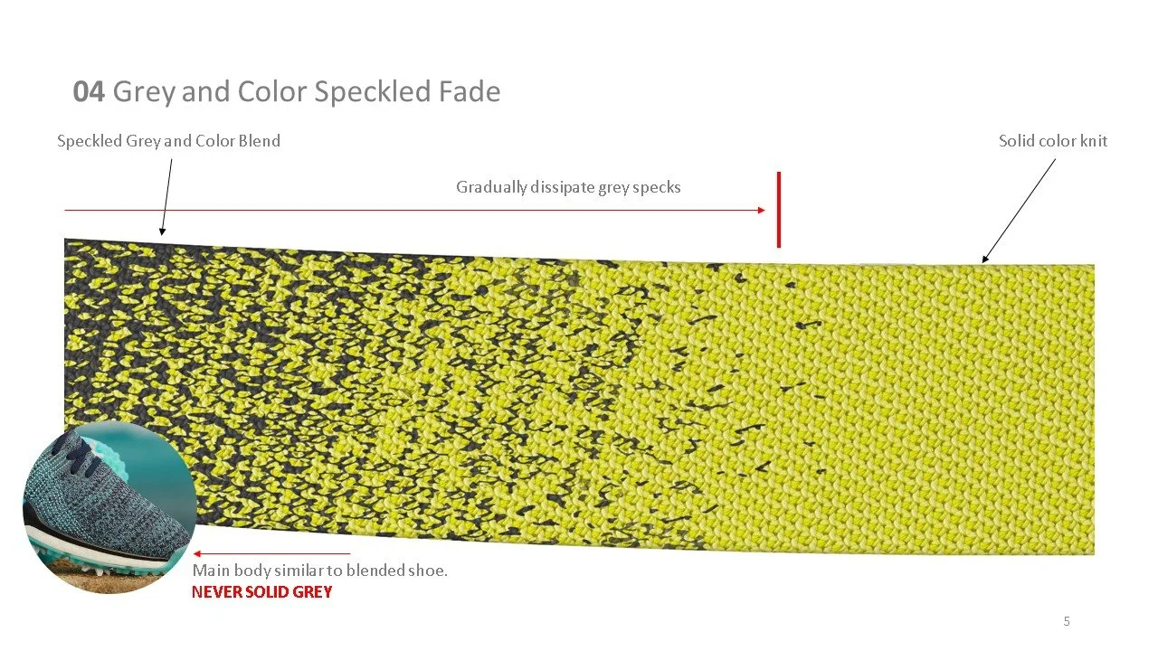
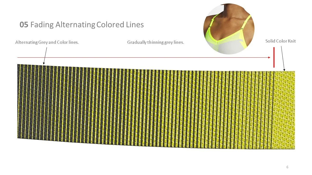
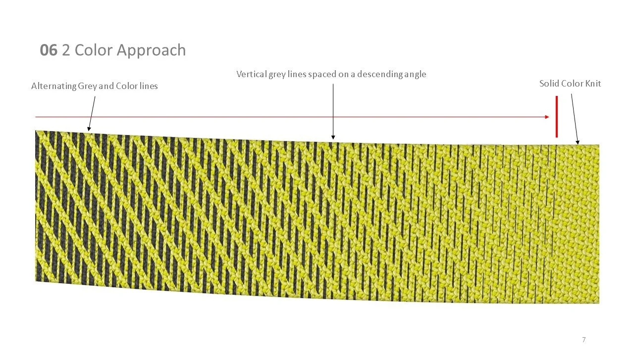
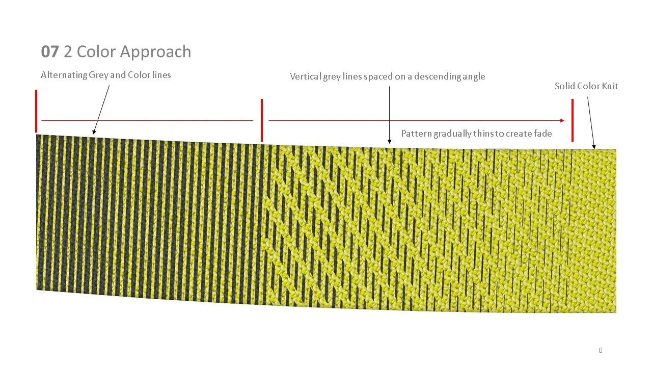
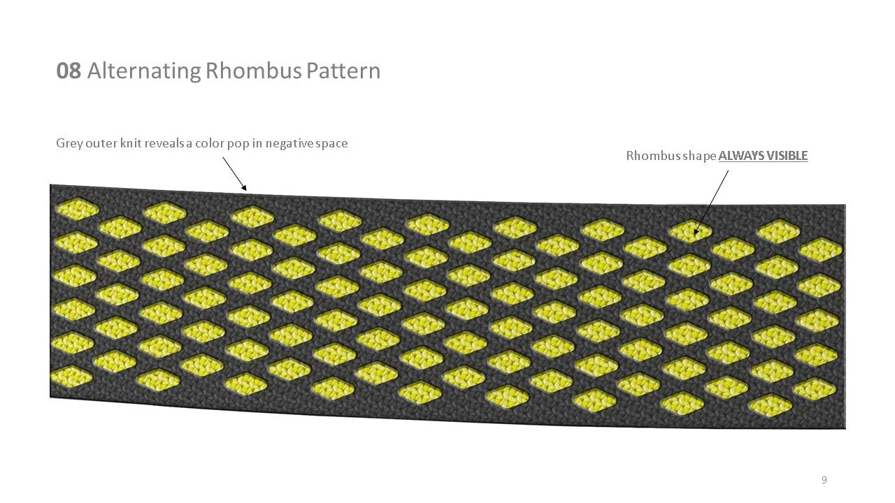
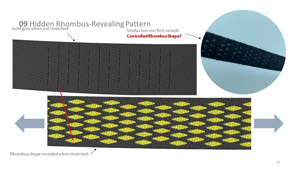
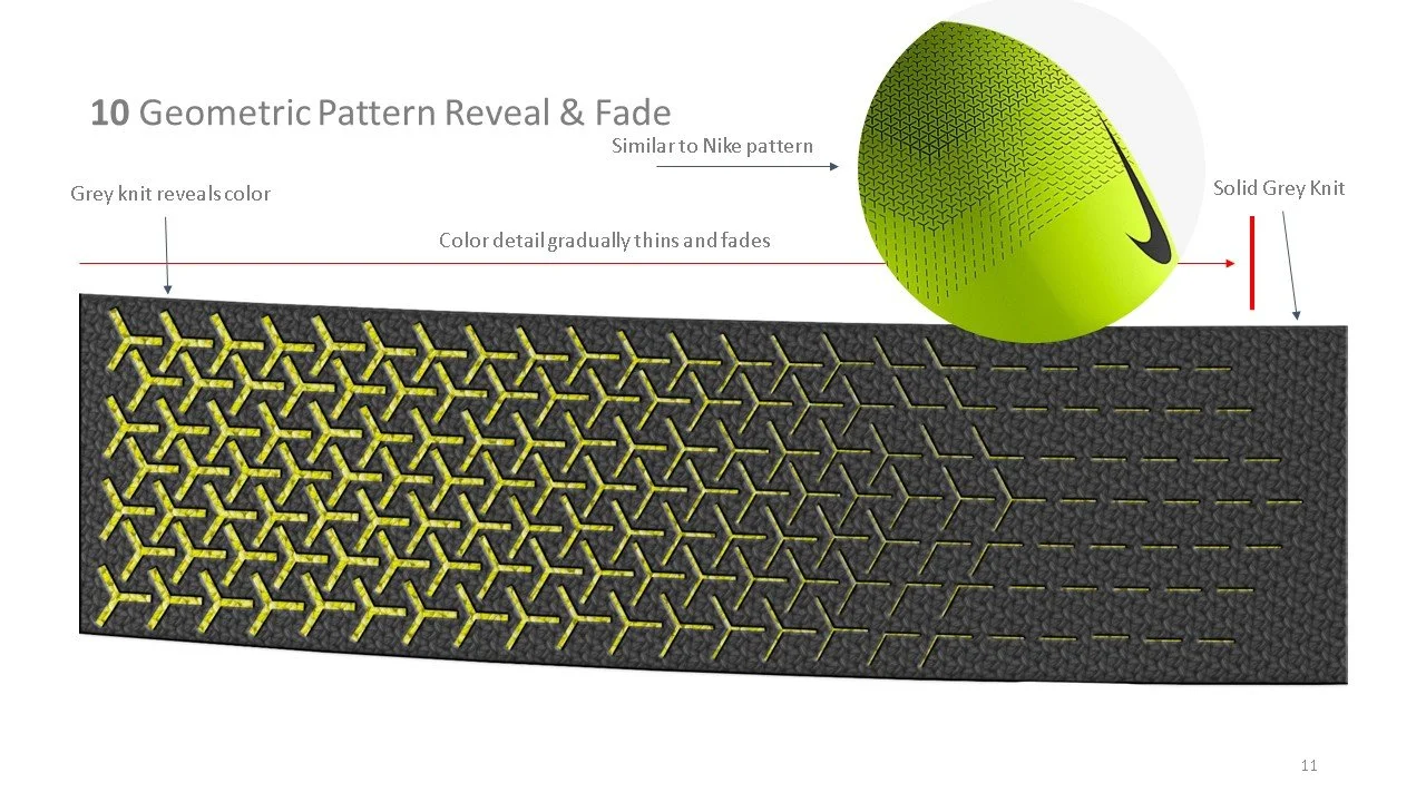
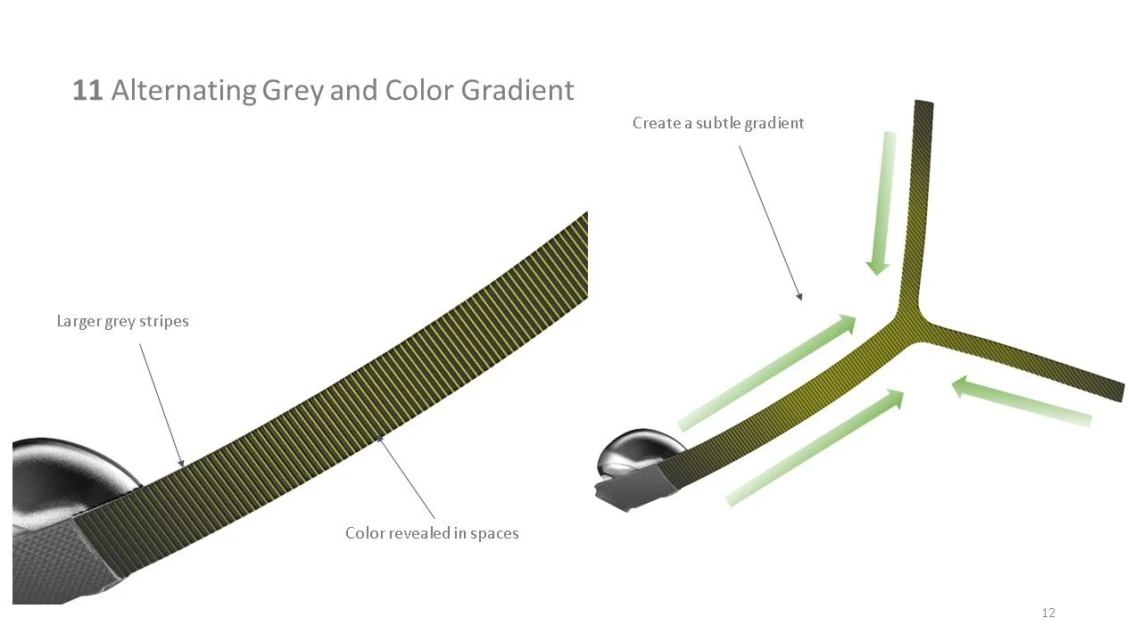
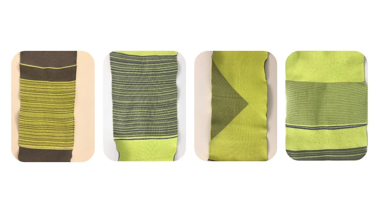
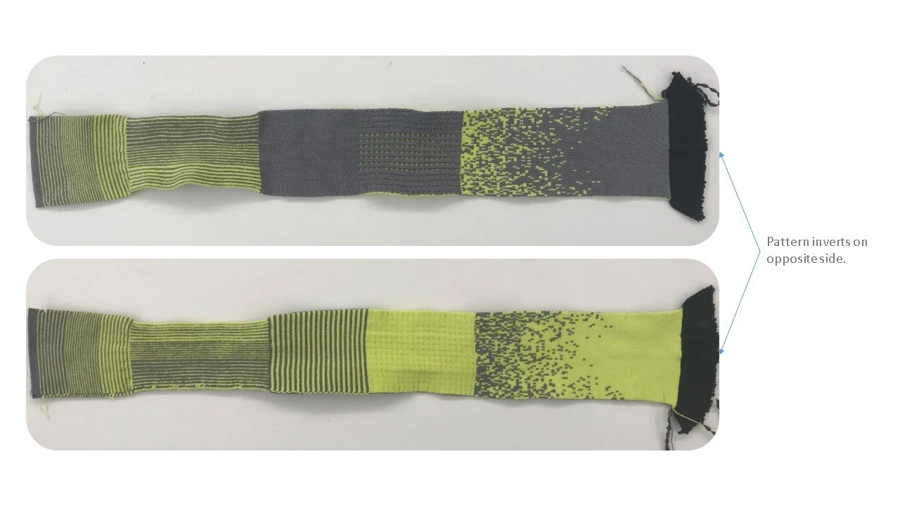
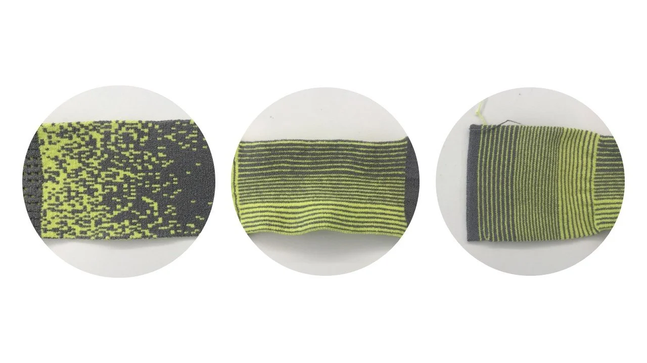
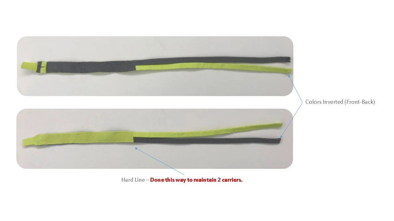
Pattern Exploration
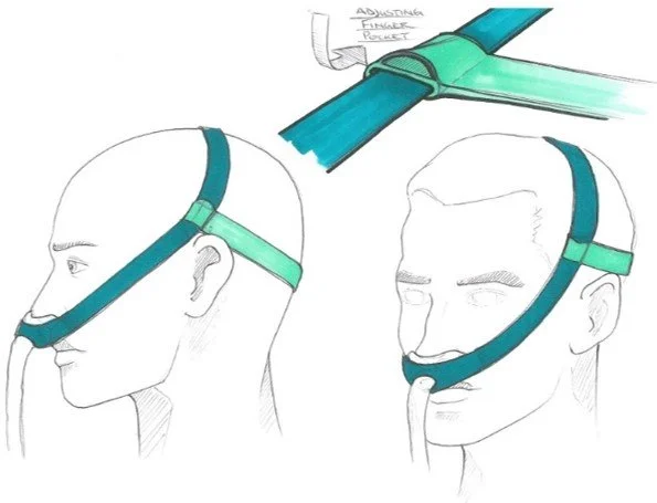
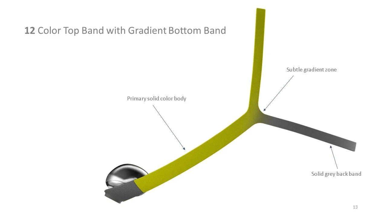
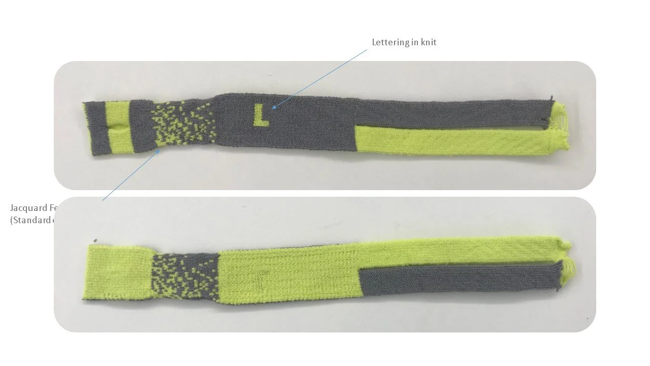
Working with our suppliers I created a spread of pattern options to have prototyped. The goal being to develop a look that was more consumer facing as well as guiding. For example, where we decided to apply a color pop could indicate the correct orientation of the mask and color reveals could help express the level of stretch being applied to the headgear aiding the correct fit.
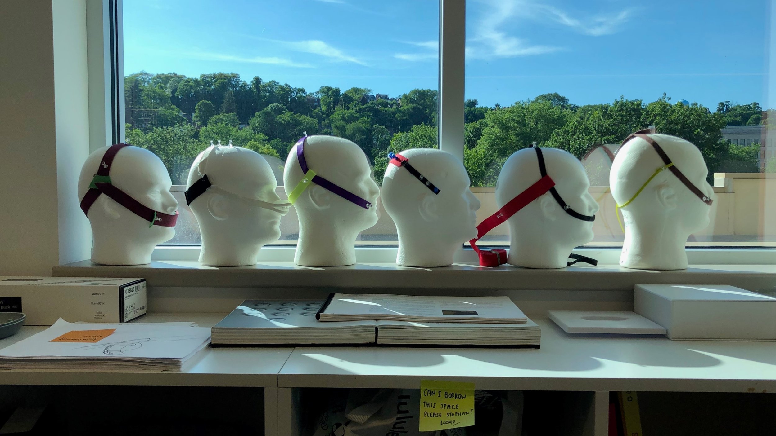
Samples
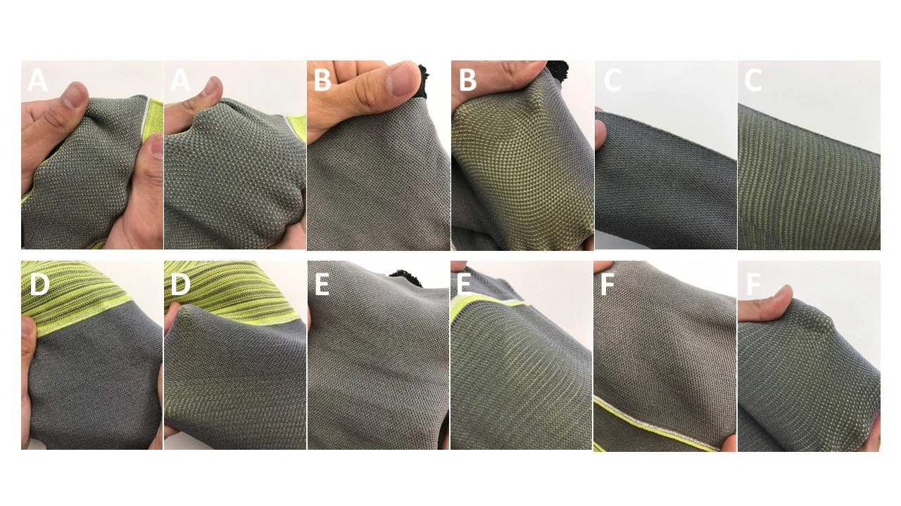
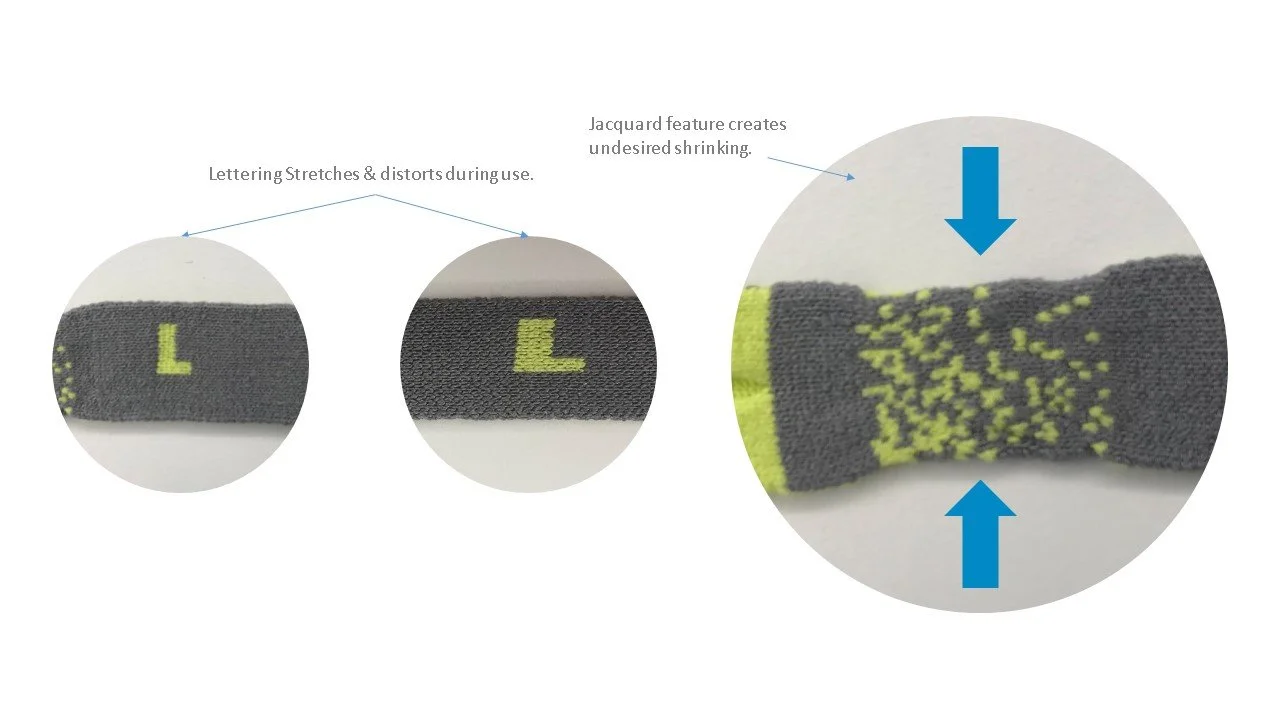
After delivering the pattern designs to our supplier we received multiple samples to evaluate. This allowed us to better understand the advantages and limitations of different knit patterns, as well as how the quality, look and feel would be impacted by the designs. Since this fabric touches the users face, comfort and breathability were strong considerations.
Color Placement & Branding
Taking the learnings from our material exploration I began looking at the color placement and branding of the mask.


Learn
Values Based Assessment
Goal
Understand the selection process when acquiring a new CPAP mask and assess reactions of compliant CPAP users towards incorporating color in a mask.
Methodology
The VBA method assesses solutions based on the values that matter to participants, going beyond initial reactions so we can understand context and drivers behind people’s preferences.

Phase One
To better understand the current stigma of sleep apnea we asked individuals about their experiences with their cpap masks.
Here is some of what we heard:
Phase Two
We wanted to understand what values are most important to a cpap user. To help frame the conversations around our concepts we first asked participants to sort 4 key values from least important to most important. These values were:
Looks Like a Quality Mask
Doesn’t Look Medical
Appropriate for the Bedroom
Fits my Personal Style

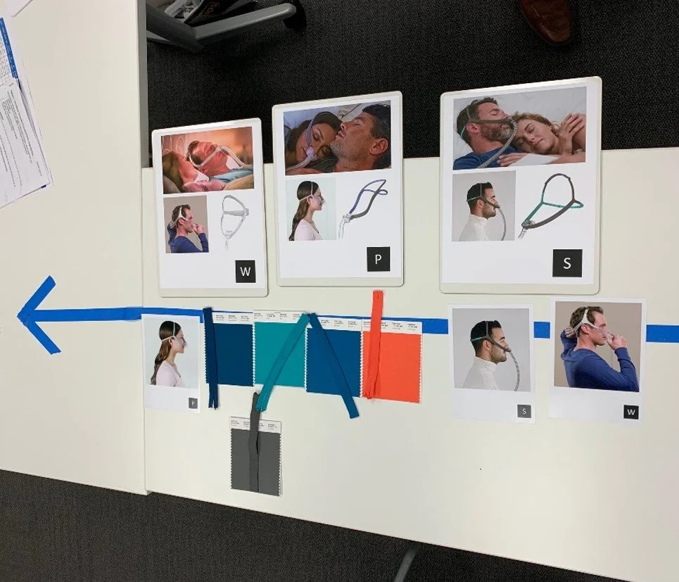
Phase Three
After learning what values were most important to our participants, we presented them with our concept, some competitor masks, and fabric samples to rank against those values.


Discovery
During the course of this research we dug deep to tease out the unarticulated needs of our customers. Most cpap users start at a place of clinical efficacy and usability, but once those 2 elements are a given, we are able to have enriching discussions about what makes an engaging experience.

Key Take Aways
Stigma in the experience
Many participants feel a stigma around their sleep apnea, which is worsened by the medical look of their masks.
Color impacts offer perception
Color and form impact perception of functional benefits like quality as well as emotional benefits like style.
Choice drives business opportunity
Participants were excited by the possibility of having a choice of masks through more familiar consumer channels.

Sustainability
Sustainability
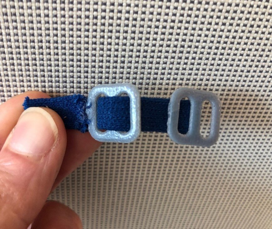
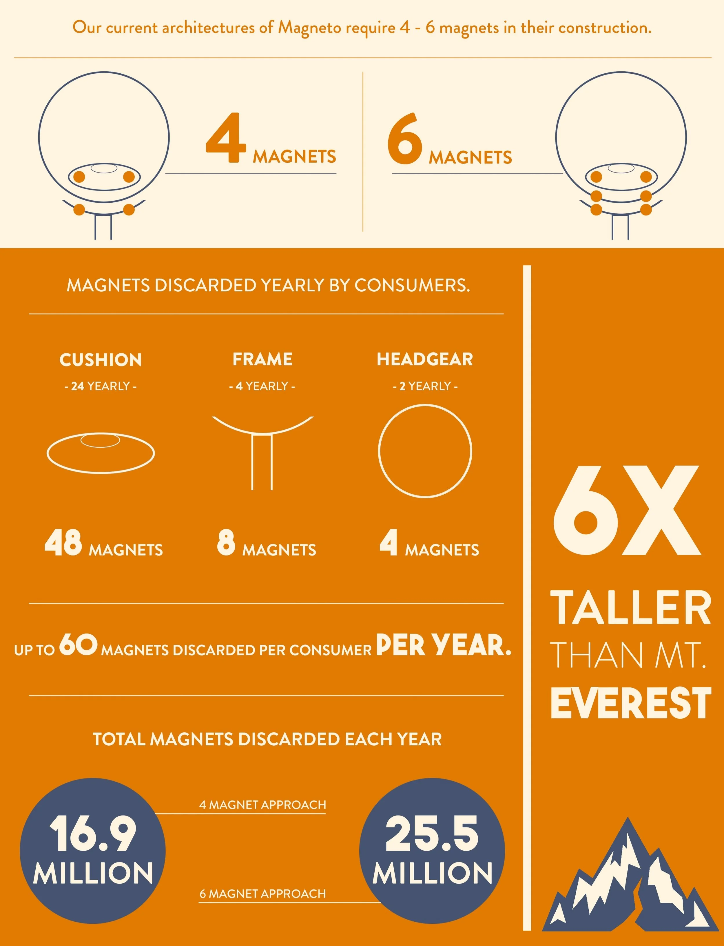
One element of this project I was very passionate about was the sustainability of our design. The original prototypes coming out of engineering were considering a 6 magnet construction, which would have produced an enormous amount of waste given the product reimbursement cycles. To try and illustrate the risk of such a decision I broke down the impact of this waste and presented it back to the project team. This ultimately led to the decision to move to a 4 magnet construction resulting in approximately 34% reduced magnet waste.
Additionally, by utilizing digital knitting, we were able to virtually eliminate fabric waste associated with cut and sew manufacturing.


Bringing it Together
Design Refinement
Aim:
To frame our design story around ‘Wellness not Illness’
What we learnt to inform our selection:
Taking function and clinical efficacy as a given. ‘Looking like a quality mask’ and ‘looks less medical’ are the most important visual attributes linking to function. Color and choice play a central role in a shifting mindset that opens people up to more abstract ideas around fitting my style and being appropriate for the bedroom.
CPAP is already seen as the route back to wellness for people with Apnea. Color becomes our opportunity to start to confidently embody this in the look and feel of our headgear.
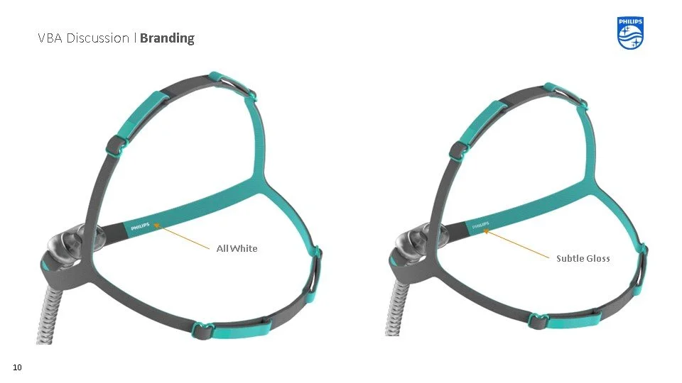
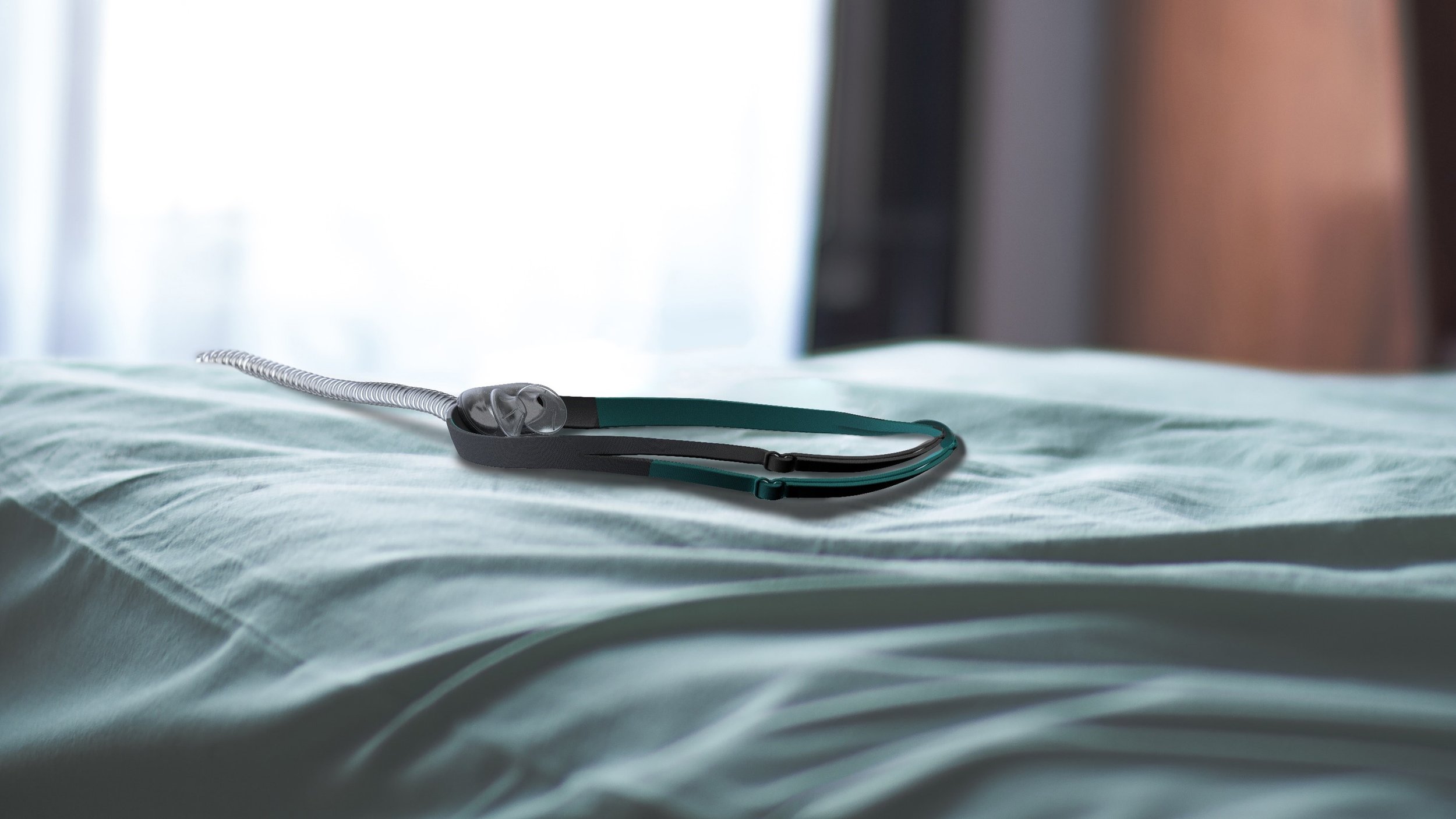
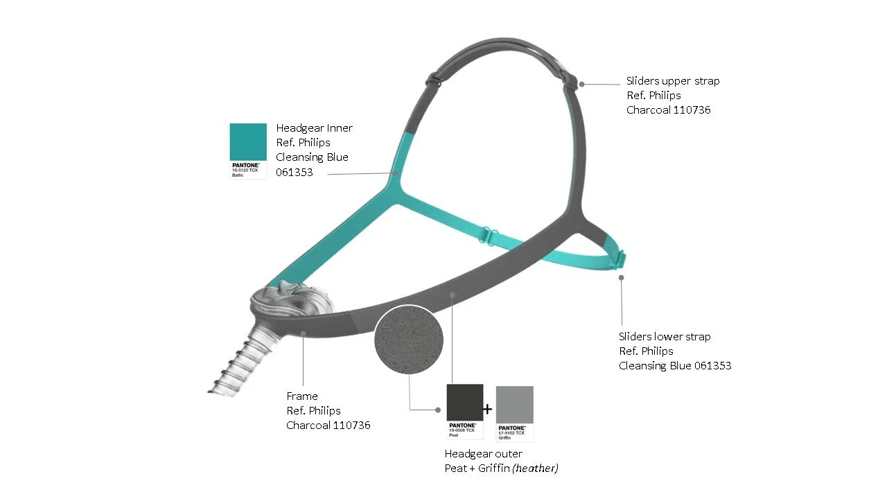
Pairing color with a darker grey is preferred with Teal as an accent color.
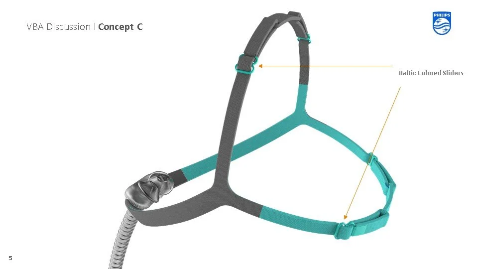
The distinct color pop on the bottom strap of the headgear is purposefully designed to help the user properly orient the headgear. This also helps contribute to its iconic look.
CMF Decision
Based on our research and the grow of our current portfolio of products we specified colors and materials working closely with our Bio-compatibility Teams to ensure the choices pass FDA requirements.
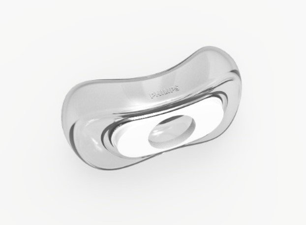
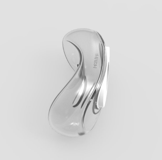
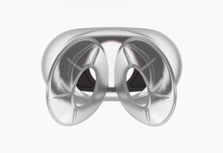
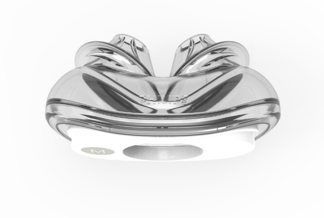
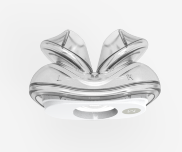
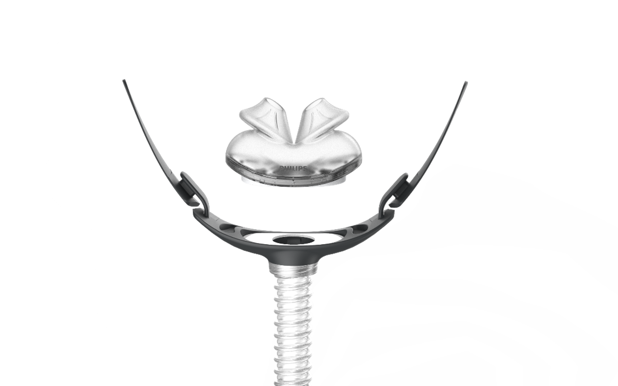
Cushion Design
Careful consideration was taken with regards to the molding, ergonomics, interfacing, sizing, and branding of the cushions.

Frame Design
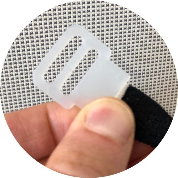
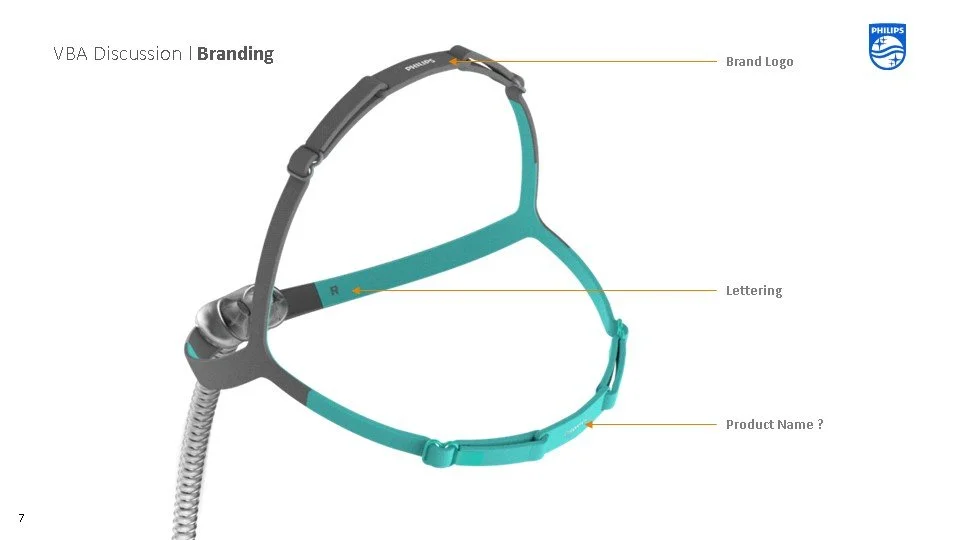
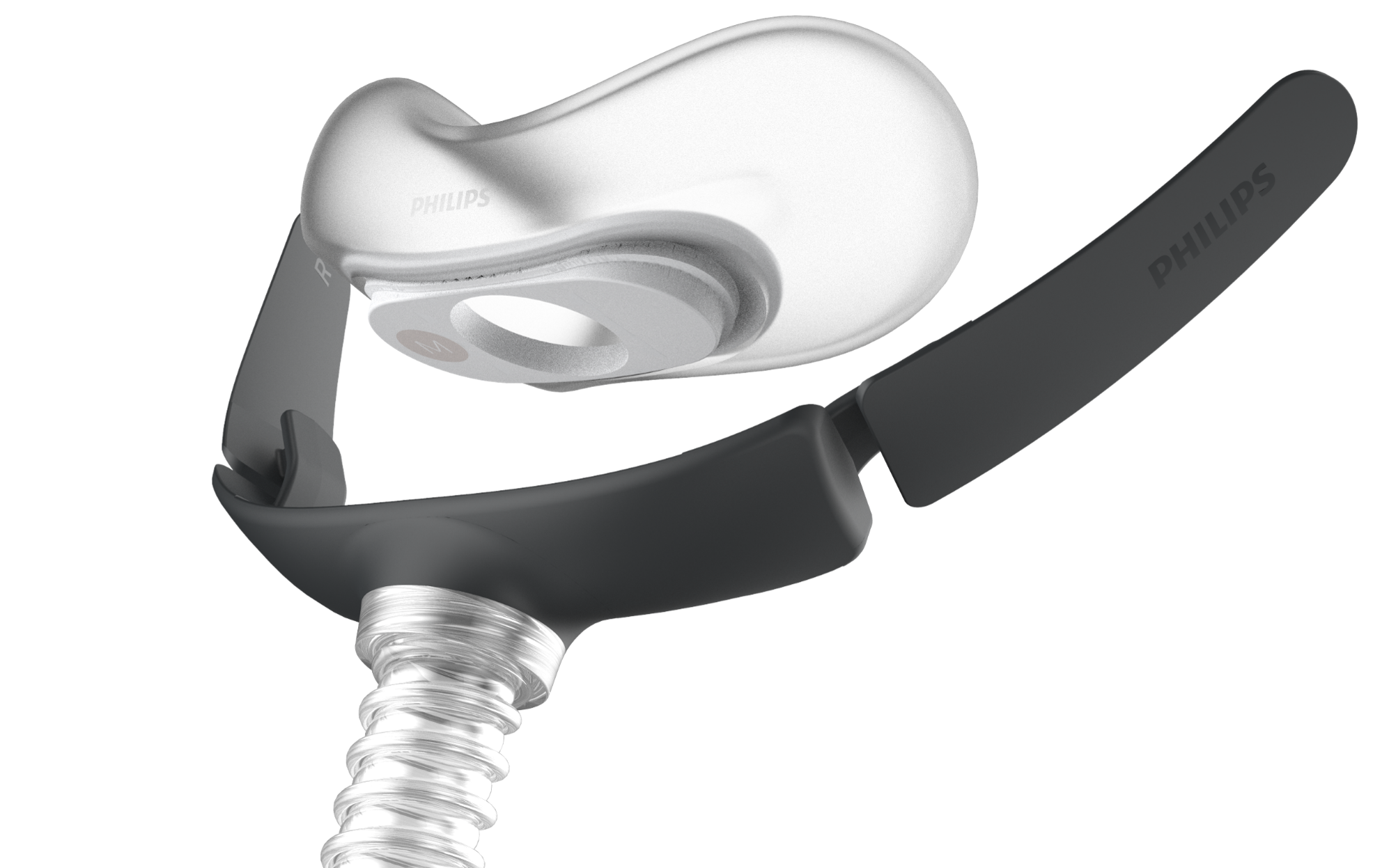
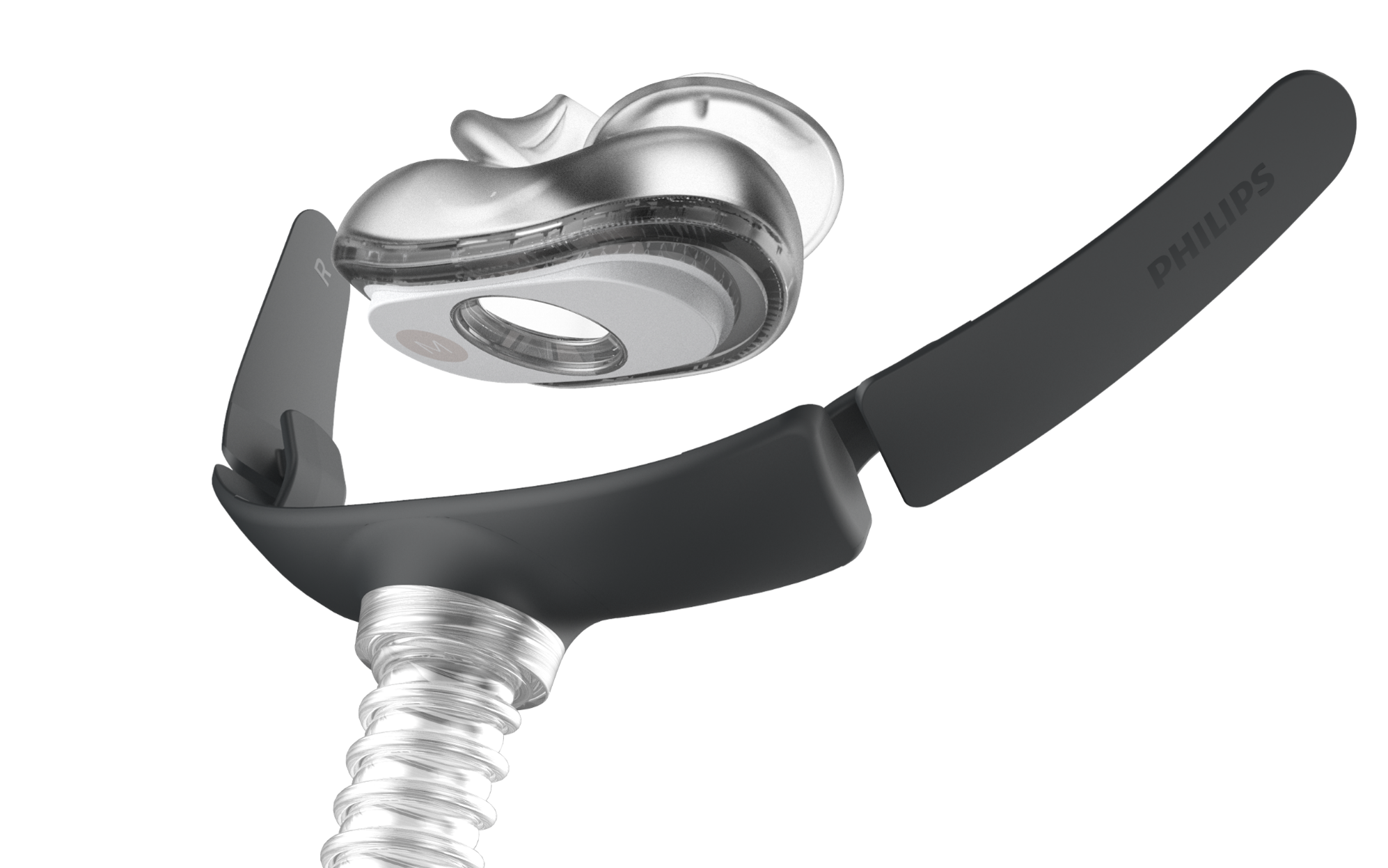
•The unique quick snap magnetic attachment facilitates the quick interchange between the 2 cushion types
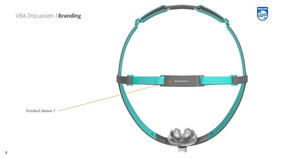
•The brand is in-molded on one of frame wings that sit inside the headgear with a possible landing spot for a product name on the opposite side
•In-mold L & R indications on the inner wing correspond to those on the headgear guiding the easy attachment/removal of the headgear.

Cushion Faceplate Design
•The sizing on the Cradle/Pillow cushions is either pad printed or laser etched on the standard faceplate of both cushions.
•Pad printing allows the opportunity to introduce color coding follow what our competitors do. With each individual sizes identifiable by a unique color.


